Python Plotly绘图教程:了解如何使用可视化工具 Plotly 在 Python 中实现和创建动态绘图和图形(例如散点图、直方图和烛台),包括一些Python Plotly绘图示例。
没有什么比精心设计的图形更能提供更清晰的报告视图并为它们做出准确结论更好的了,因此在数据科学家应该进行的探索性数据分析步骤中,使用可视化工具是关键。
Python如何使用Plotly绘图?在本教程中,我们将学习如何使用Plotly可视化工具在 Python 中创建动态绘图。
我们将在本教程中使用的开发环境是Jupyter 实验室,如果你没有安装它,此链接应该可以帮助你安装它。
确保安装所需的库:
pip install numpy
pip install pandas
pip install plotly
如果你没有使用 Anaconda 环境,那么你必须为 jupyter lab 手动安装 plotly 扩展:
$ jupyter labextension install jupyterlab-plotly安装完所有内容后,打开一个新的 jupyter 实验室并在第一个单元格中导入这些库:
import pandas as pd
import numpy as np
import plotly.offline as py
import plotly.graph_objs as go
import plotly.figure_factory as ff
import yfinance as yf
import pandas_datareader as pdr

py.init_notebook_mode()
我们正在运行该 方法以启用 plotly 库的使用,而无需为此注册和获取 API 密钥。init_notebook_mode()
Python Plotly绘图教程:简单线图
要使用 Plotly 创建图形,我们需要创建Figure类的实例,该类的主要组件是:
- 布局:这是元数据和出现在图形中的外部信息,如主标题和轴的名称。我们可以通过
layout为Figure对象的属性赋值来添加布局,该属性是类的一个实例go.Layout - Traces: 这是 Plotly 提供的一组图形对象,如 Scatter、Bar、Histogram 图等。我们可以通过调用Figure对象的方法
add_trace()来添加跟踪。
这是显示函数f(x) = 2x的图形的简单示例。
x = [ i for i in range(-10,10) ]

y = [ i*2 for i in range(-10,10) ]

xaxis = go.layout.XAxis(title="X Axis")
yaxis = go.layout.YAxis(title="Y Axis")

fig = go.Figure(layout=go.Layout(title="Simple Line Plot", xaxis=xaxis, yaxis=yaxis))
fig.add_trace(go.Scatter(x=x, y=y))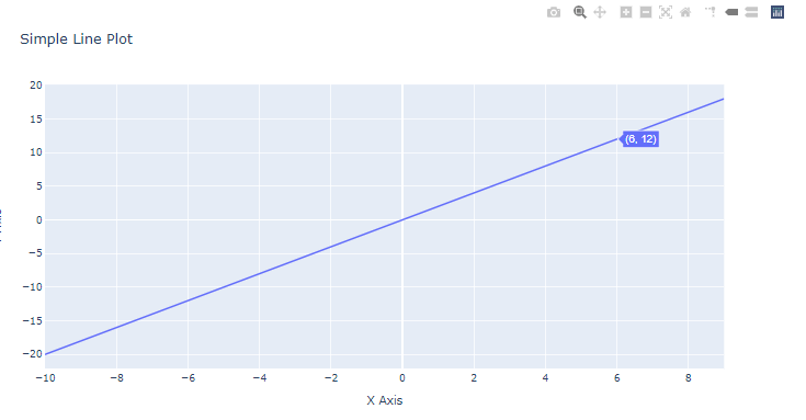 这是显示由以下公式定义的sigmoid 函数(通常用作深度学习中的激活函数)图形的另一个示例:s(x) = 1/ (1 + exp(-x))。
为了改变线条的颜色,我们为marker属性分配一个字典,并指定color一个键和颜色的名称(在我们的例子中,红色)作为一个值。
def sigmoid(x):
return 1 / (1 + np.exp((-1) * x))
x = sorted(np.random.random(100) * 10 - 5)
y = [ sigmoid(i) for i in x ]
xaxis = go.layout.XAxis(title="X Axis")
yaxis = go.layout.YAxis(title="Y Axis")
fig=go.Figure(layout=go.Layout(title="Sigmoid Plot",xaxis=xaxis, yaxis=yaxis))
fig.add_trace(go.Scatter(x=x, y=y, marker=dict(color="red")))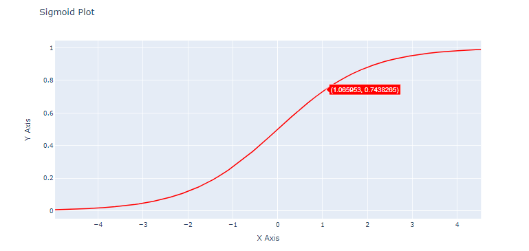 Python如何使用Plotly绘图?多个散点图
在本节中,我们将学习绘制点状图(与第一节中的连续线不同)。我们将尝试在同一图中绘制 4 个散点图。
为了生成随机数据,我们将使用np.random.randint()Numpy的方法,除了数组的大小(在我们的例子中,让我们使用50)之外,我们还将指定两个边界(最低和最高数字)。
为了获得绘图的虚线形状格式,我们需要为属性分配mode值markers。
l = []
for _ in range(5):
l.append([ sorted(np.random.randint(low=0, high=10000, size=50)), sorted(np.random.randint(low=0, high=10000, size=50)) ])
l = np.array(l)
figure = go.Figure(layout=go.Layout(title="Simple Scatter Example", xaxis=go.layout.XAxis(title="X"), yaxis=go.layout.YAxis(title="Y")))
for i in range(len(l)):
figure.add_trace(go.Scatter(x=l[i][0],y=l[i][1], mode="markers", name=f" Distribution {i+1} "))
figure.show()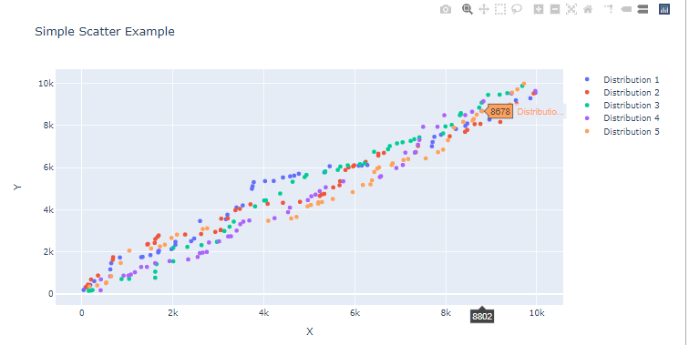 Python Plotly绘图示例:条形图和分布图
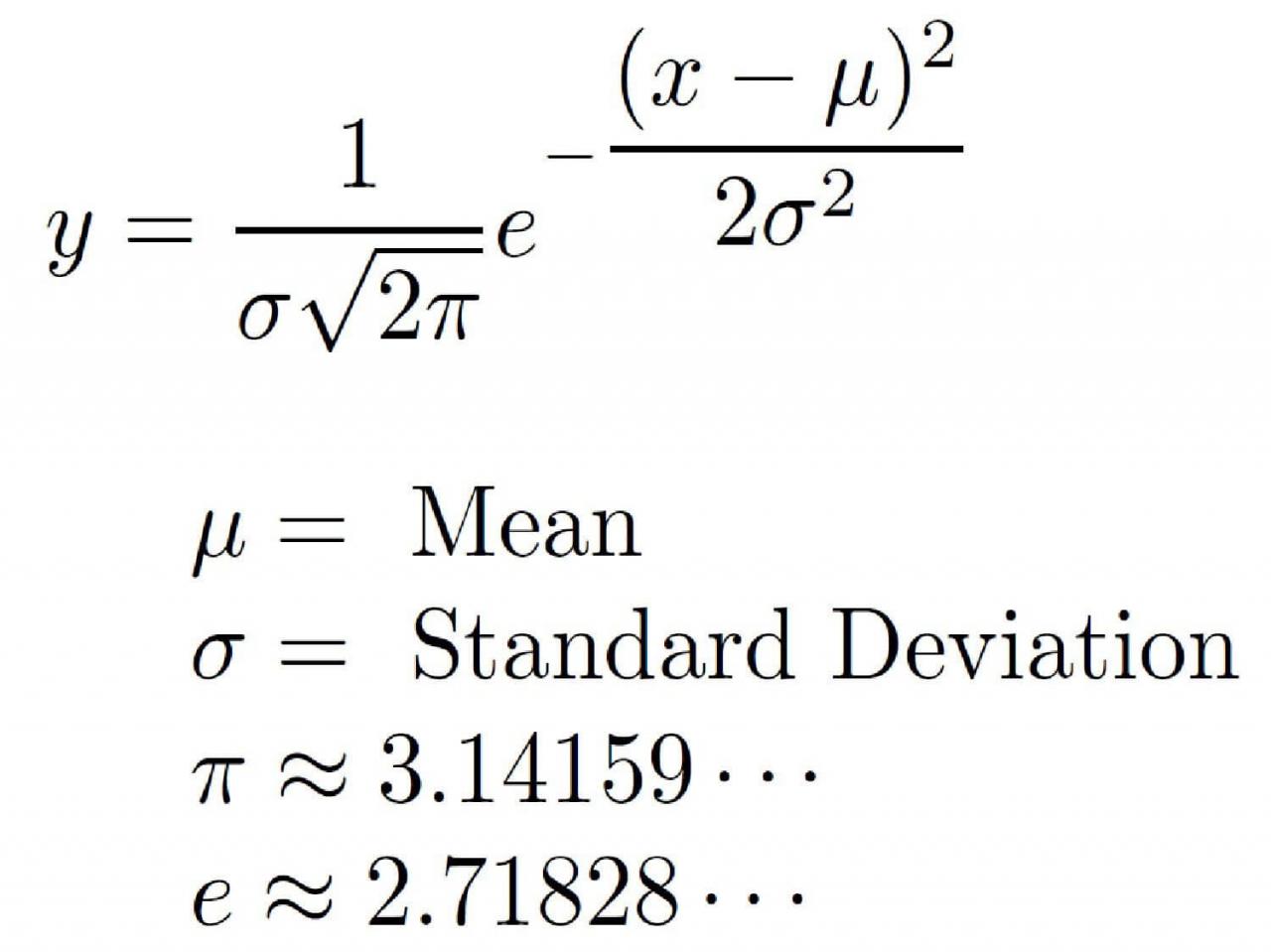
一个正常的(高斯)分布是最有名的统计分布中。它由两个主要属性定义,即均值μ和标准偏差σ,来自以下公式:
 首先,我们将使用 Numpy 和 method
np.random.normal()函数创建一个简单的正态分布。然后,我们将其绘制为没有分布线曲线的直方图。
dist = np.random.normal(loc=0, scale=1, size=50000)
figure = go.Figure()
figure.add_trace(go.Histogram(x=dist,))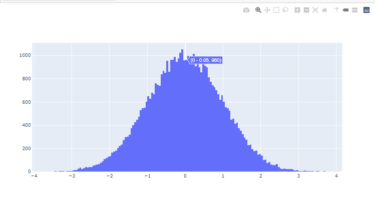 现在让我们创建多个分布,具有相同的均值μ=0,但通过更改标准偏差σ值。我们的分布图越大越扁平(如下图所示)。
在这种情况下,我们将使用plotly.figure_factory提供更复杂图形对象的模块:
d=[{"values":np.random.normal(0,0.5,10000), "information": " Normal Distribution with mean 0 and std= 0.5"},
  {"values":np.random.normal(0,1,10000), "information": " Normal Distribution with mean 0 and std= 1"},
  {"values":np.random.normal(0,1.5,10000), "information": " Normal Distribution with mean 0 and std= 1.5"},
  {"values":np.random.normal(0,2,10000), "information": " Normal Distribution with mean 0 and std= 2"},
  {"values":np.random.normal(0,5,10000), "information": " Normal Distribution with mean 0 and std= 5"}]

ff.create_distplot([ele["values"] for ele in d], group_labels=[ele["information"] for ele in d], show_hist=False)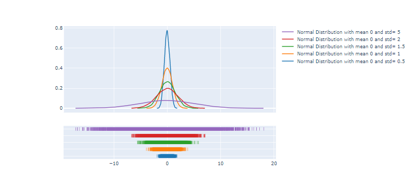
3D 散点图
Python如何使用Plotly绘图?要创建3D散点图它也很简单,首先我们需要生成的数字随机阵列X,ÿ和ž使用np.random.randint()。然后我们将通过将其添加为Figure对象的跟踪来创建Scatter3d图。
x = np.random.randint(low=5, high=100, size=15)
y = np.random.randint(low=5, high=100 ,size=15)
z = np.random.randint(low=5, high=100, size=15)

fig=go.Figure()
fig.add_trace(go.Scatter3d(x=x, y=y, z=z, mode="markers"))
每个特征在数据科学中都被认为是一个维度,特征越高,对属于不同标签的数据进行分类的准确性就越高。
我们将使用包含鸢尾花种类信息的鸢尾花数据集;setosa , versicolor和virginica。可用的特征是萼片宽度、萼片长度、花瓣宽度和花瓣长度。你可以在此处下载数据集。
我们将使用 3D 散点图来显示三个特征(萼片宽度/萼片长度/花瓣宽度)并将每个数据点标记为其物种类型。
在Pandas 中,unique().tolist()允许我们将 Pandas 系列中的所有唯一值存储在列表中,就像这里我们将物种类型存储在列表 ( species_types) 中一样。
fig = go.Figure()
species_types = df_iris.species.unique().tolist()

for specie in species_types:
    b = df_iris.species == specie
    fig.add_trace(go.Scatter3d(x=df_iris["sepal_length"][b], y=df_iris["sepal_width"][b], z=df_iris["petal_width"][b], name=specie, mode="markers"))

fig.show()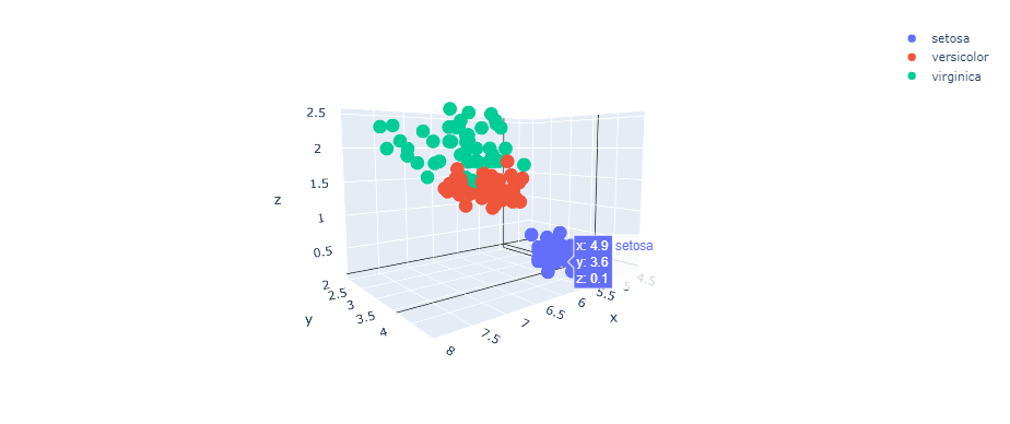
令人惊奇的是,你可以与 3D 绘图交互并查看它的不同位置。
Python Plotly绘图示例:将 Plotly 用于金融数据和烛台图
在本节中,我们将使用Yahoo Finance API 的yfinance包装器和pandas-datareader库来读取 Apple 和 Microsoft 的股票价格数据。
如果你需要更深入地了解如何从这些库中导入财务数据,我建议你查看本教程。
我们将首先使用一个简单的线图分别显示它们的收盘价来比较AAPL和MSFT的股价变化:
yf.pdr_override()

symbols = ["AAPL","MSFT"]
stocks = []
for symbol in symbols:
    stocks.append(pdr.get_data_yahoo(symbol, start="2020-01-01", end="2020-05-31"))

fig = go.Figure()

for stock,symbol in zip(stocks,symbols):
    fig.add_trace(go.Scatter(x=stock.index, y=stock.Close, name=symbol))

fig.show()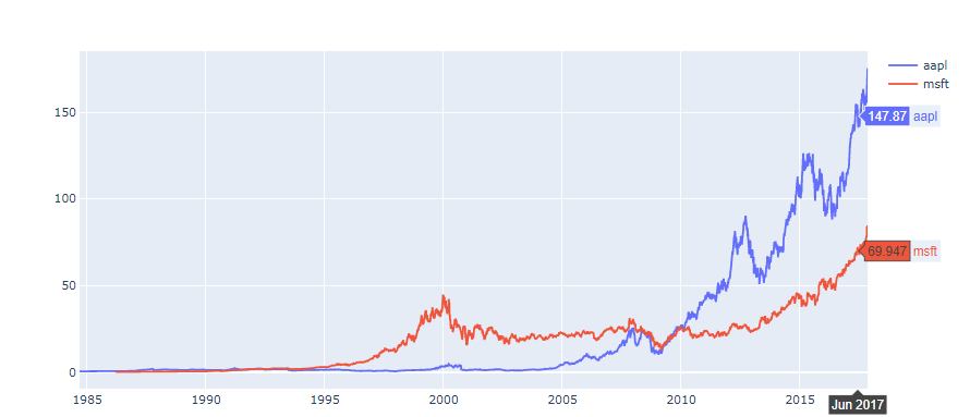
Python如何使用Plotly绘图?我们现在将plotly.figure_factory用于生成烛台图表。
df_aapl = pdr.get_data_yahoo(symbol, start="2020-01-01", end="2020-05-31")
ff.create_candlestick(dates=df_aapl.index, open=df_aapl.Open, high=df_aapl.High, low=df_aapl.Low, close=df_aapl.Close)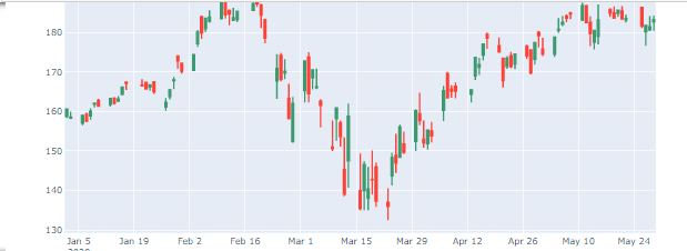
Python Plotly绘图教程总结
在本教程中,你已经学会了:
- 在 numpy 和 pandas 中生成数字。
- 创建不同类型的图(散点图、直方图等)
- 改变你的人物的美感 (
color,marker)。 - Python Plotly绘图示例
- 绘制统计分布(例如高斯分布)。
- 绘制烛台图表。