Python如何画柱状图?您可以使用以下
Python画柱状图代码模板在 Python 中使用
Matplotlib绘制直方图:
import matplotlib.pyplot as plt

x = [value1, value2, value3,....]
plt.hist(x, bins = number of bins)
plt.show()
Python如何画直方图?仍然不确定如何在Python中绘制直方图?
如果是这样,我将使用一个简单的示例向您展示在Python中绘制直方图的完整步骤。
使用Matplotlib在Python中绘制直方图的步骤
第 1 步:安装 Matplotlib 包
如果您还没有这样做,请使用以下命令(在 Windows 下)安装Matplotlib 包:
pip install matplotlib
您可以参考以下指南以获取在 Python 中安装包的说明。
第 2 步:收集直方图的数据
例如,假设您有以下 100 个人年龄的数据:
Age
1,1,2,3,3,5,7,8,9,10,
10,11,11,13,13,15,16,17,18,18,
18,19,20,21,21,23,24,24,25,25,
25,25,26,26,26,27,27,27,27,27,
29,30,30,31,33,34,34,34,35,36,
36,37,37,38,38,39,40,41,41,42,
43,44,45,45,46,47,48,48,49,50,
51,52,53,54,55,55,56,57,58,60,
61,63,64,65,66,68,70,71,72,74,
75,77,81,83,84,87,89,90,90,91
稍后您将看到如何根据上述数据绘制直方图。
第 3 步:确定 bin 的数量
Python如何画直方图?接下来,确定要用于直方图的bin数。
为简单起见,让我们将 bin 的数量设置为 10。在本指南的最后,我将向您展示另一种派生 bin 的方法。
第 4 步:使用 matplotlib 在 Python 中绘制直方图
您现在可以根据您在本指南开头看到的模板绘制直方图:
import matplotlib.pyplot as plt

x = [value1, value2, value3,....]
plt.hist(x, bins = number of bins)
plt.show()
对于我们的示例,这是应用上述模板后的完整Python画柱状图代码:
import matplotlib.pyplot as plt

x = [1,1,2,3,3,5,7,8,9,10,
     10,11,11,13,13,15,16,17,18,18,
     18,19,20,21,21,23,24,24,25,25,
     25,25,26,26,26,27,27,27,27,27,
     29,30,30,31,33,34,34,34,35,36,
     36,37,37,38,38,39,40,41,41,42,
     43,44,45,45,46,47,48,48,49,50,
     51,52,53,54,55,55,56,57,58,60,
     61,63,64,65,66,68,70,71,72,74,
     75,77,81,83,84,87,89,90,90,91
     ]

plt.hist(x, bins=10)
plt.show()
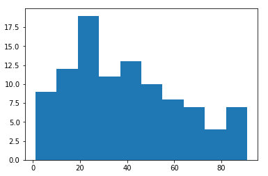
运行以上
Matplotlib绘制直方图代码,你会得到下面的直方图:
Python如何画柱状图?就是这样!你现在应该在 Python 中有你的直方图。
如果需要,您可以进一步设置
直方图的样式。设置直方图样式的一种方法是在代码末尾添加以下语法:
plt.style.use('ggplot')
对于我们的示例,Python画柱状图代码如下所示:
import matplotlib.pyplot as plt

x = [1,1,2,3,3,5,7,8,9,10,
     10,11,11,13,13,15,16,17,18,18,
     18,19,20,21,21,23,24,24,25,25,
     25,25,26,26,26,27,27,27,27,27,
     29,30,30,31,33,34,34,34,35,36,
     36,37,37,38,38,39,40,41,41,42,
     43,44,45,45,46,47,48,48,49,50,
     51,52,53,54,55,55,56,57,58,60,
     61,63,64,65,66,68,70,71,72,74,
     75,77,81,83,84,87,89,90,90,91
     ]

plt.style.use('ggplot')
plt.hist(x, bins=10)
plt.show()
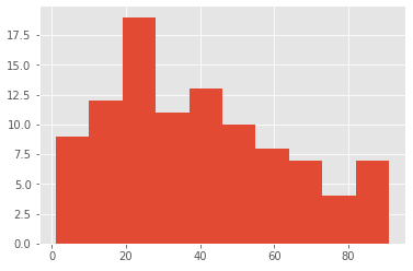
运行代码,你会得到这个样式的直方图:
仅通过查看直方图,您可能已经注意到正偏度。
您可以使用
scipy库在 Python 中导出偏斜 。
这是您可以用来为我们的示例导出偏斜的Python画柱状图代码:
from scipy.stats import skew

x = [1,1,2,3,3,5,7,8,9,10,
     10,11,11,13,13,15,16,17,18,18,
     18,19,20,21,21,23,24,24,25,25,
     25,25,26,26,26,27,27,27,27,27,
     29,30,30,31,33,34,34,34,35,36,
     36,37,37,38,38,39,40,41,41,42,
     43,44,45,45,46,47,48,48,49,50,
     51,52,53,54,55,55,56,57,58,60,
     61,63,64,65,66,68,70,71,72,74,
     75,77,81,83,84,87,89,90,90,91
     ]

print (skew(x))
在 Python 中运行代码后,您将获得以下偏斜:
0.4575278444409153
确定 bin 数量的其他方法
最初,为了简单起见,我们将 bin 的数量设置为 10。
或者,您可以使用以下公式推导出 bin:
- n = 观察次数
- 范围= 最大值 - 最小值
- 间隔数= √n
- 间隔宽度=范围/(间隔数量)
然后可以使用这些公式来创建频率表,然后是直方图。
回想一下,我们的数据集包含以下 100 个观察结果:
Age
1,1,2,3,3,5,7,8,9,10,
10,11,11,13,13,15,16,17,18,18,
18,19,20,21,21,23,24,24,25,25,
25,25,26,26,26,27,27,27,27,27,
29,30,30,31,33,34,34,34,35,36,
36,37,37,38,38,39,40,41,41,42,
43,44,45,45,46,47,48,48,49,50,
51,52,53,54,55,55,56,57,58,60,
61,63,64,65,66,68,70,71,72,74,
75,77,81,83,84,87,89,90,90,91
Python如何画直方图?使用我们的公式:
- n = 观察数 = 100
- 范围 = 最大值 – 最小值 = 91 – 1 = 90
- 间隔数 = √n = √100 = 10
- 间隔宽度 = 范围/(间隔数量)= 90/10 = 9
基于此信息,频率表将如下所示:
| 间隔(bin) |
频率 |
| 0 -9 |
9 |
| 10 -19 |
13 |
| 20 -29 |
19 |
| 30 -39 |
15 |
| 40 -49 |
13 |
| 50 -59 |
10 |
| 60 -69 |
7 |
| 70 -79 |
6 |
| 80 -89 |
5 |
| 90 – 99 |
3 |
请注意,第一个间隔的起点是 0,这非常接近我们数据集中的最小观察值 1。例如,如果另一个数据集中的最小观测值为 20,则第一个间隔的起点应为 20,而不是 0。
对于下面 Python 代码中的
bin ,您需要指定以蓝色突出显示的值,而不是特定的数字(例如我们之前使用的 10)。不要忘记包括最后一个值 99,下面使用Matplotlib绘制直方图。
Python如何画柱状图?这就是Python画柱状图代码的样子:
import matplotlib.pyplot as plt
x = [1,1,2,3,3,5,7,8,9,10,
10,11,11,13,13,15,16,17,18,18,
18,19,20,21,21,23,24,24,25,25,
25,25,26,26,26,27,27,27,27,27,
29,30,30,31,33,34,34,34,35,36,
36,37,37,38,38,39,40,41,41,42,
43,44,45,45,46,47,48,48,49,50,
51,52,53,54,55,55,56,57,58,60,
61,63,64,65,66,68,70,71,72,74,
75,77,81,83,84,87,89,90,90,91
]
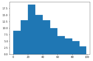
plt.hist(x, bins=[0,10,20,30,40,50,60,70,80,90,99])
plt.show()
运行代码,您将得到以下直方图:
您会注意到直方图与我们之前看到的相似,正偏斜也很明显。