按钮是网页中最常用的元素之一。按钮用于事件处理和与用户交互。从提交表单到查看一些信息, 我们必须单击按钮。
Button标记用于在HTML中创建按钮。下面是一个简单的按钮标签示例:
例子:
<!DOCTYPE html>
< html >
< head >
< title >
button tag
</ title >
</ head >
< body >
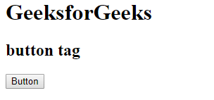
< h1 >lsbin</ h1 >
< h2 >button tag</ h2 >
< button >Button</ button >
</ body >
</ html >输出如下:
按钮中的基本样式:有许多CSS属性用于设置按钮元素的样式, 下面将进行讨论:
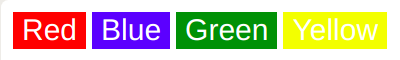
背景颜色:
此属性用于设置按钮的背景色。
语法如下:
element {
    // background-color style
}
例子:
<!DOCTYPE html>
< html >

< head >
     < title >
         button background Color
     </ title >

     < style >
         .button {
             border: none;
             color: white;
             text-align: center;
             font-size: 20px;
         }
         .b1 {

             /* Set button background color */
             background-color: red;
         }
         .b2 {

              /* Set button background color */
             background-color: blue;
         }
         .b3 {

              /* Set button background color */
             background-color: green;
         }
         .b4 {

              /* Set button background color */
             background-color: yellow;
         }
     </ style >
</ head >

< body >
     < button class = "button b1" >Red</ button >
     < button class = "button b2" >Blue</ button >
     < button class = "button b3" >Green</ button >
     < button class = "button b4" >Yellow</ button >
</ body >
</ html >
输出如下:
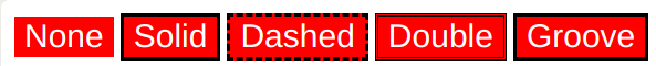
边境:
此属性用于设置按钮的边框。
语法如下:
element {
    // border style
}
例子:
<!DOCTYPE html>
< html >

< head >
     < title >
         button background Color
     </ title >

     < style >
         .button {
             background-color: red;
             color: white;
             text-align: center;
             font-size: 20px;
         }
         .b1 {

             /* Set border property */
             border : none;
         }
         .b2 {

             /* Set border property */
             border : 2px black solid;
         }
         .b3 {

             /* Set border property */
             border : 2px black dashed;
         }
         .b4 {

             /* Set border property */
             border : 2px black double;
         }
         .b5 {

             /* Set border property */
             border : 2px black groove;
         }
     </ style >
</ head >

< body >
     < button class = "button b1" >None</ button >
     < button class = "button b2" >Solid</ button >
     < button class = "button b3" >Dashed</ button >
     < button class = "button b4" >Double</ button >
     < button class = "button b5" >Groove</ button >
</ body >
</ html >
输出如下:
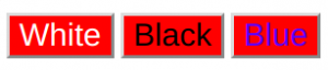
颜色:
此属性用于设置按钮中文本的颜色。可以根据颜色名称, 颜色十六进制代码等设置颜色值。
语法如下:
element {
    // color style
}
例子:
<!DOCTYPE html>
< html >

< head >
     < title >
         button background Color
     </ title >

     < style >
         .button {
             background-color: red;
             border:none;
             text-align: center;
             font-size: 20px;
         }
         .b1 {

             /* Set the color of text */
             color: white;
         }
         .b2 {

             /* Set the color of text */
             color: black;
         }
         .b3 {

             /* Set the color of text */
             color: blue;
         }
     </ style >
</ head >

< body >
     < button class = "button b1" >White</ button >
     < button class = "button b2" >Black</ button >
     < button class = "button b3" >Blue</ button >
</ body >
</ html >
输出:
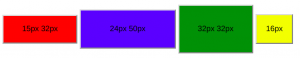
填充:
此属性用于设置按钮中的填充。
语法如下:
element {
    // padding style
}
例子:
<!DOCTYPE html>
< html >

< head >
     < title >
         button padding property
     </ title >

     < style >
         .b {
           border : none;
           font-size: 16px;
         }

         .b1 {
             background-color: red;
             padding : 15px 32px;
         }
         .b2 {
             background-color: blue;
             padding: 24px 50px;
         }
         .b3 {
             background-color: green;
             padding: 32px 32px;
         }
         .b4 {
             background-color: yellow;
             padding: 16px;
         }
     </ style >
</ head >

< body >
     < button class = "button b1" >15px 32px</ button >
     < button class = "button b2" >24px 50px</ button >
     < button class = "button b3" >32px 32px</ button >
     < button class = "button b4" >16px</ button >
</ body >
</ html >
输出如下:
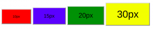
字体大小:
此属性用于设置按钮中文本的大小。更改像素值以获得所需的大小。
语法如下:
element {
    // font-size style
}
例子:
<!DOCTYPE html>
< html >

< head >
     < title >
         button font-size property
     </ title >

     < style >
         .button {
             padding : 15px 32px;
             border : none /* none */
             font-size: 16px;
         }

         .b1 {
             background-color: red;
             font-size: 10px;
         }
         .b2 {
             background-color: blue;
             font-size: 15px;
         }
         .b3 {
             background-color: green;
             font-size: 20px;
         }
         .b4 {
             background-color: yellow;
             font-size: 30px;
         }
     </ style >
</ head >

< body >
     < button class = "button b1" >10px </ button >
     < button class = "button b2" >15px</ button >
     < button class = "button b3" >20px</ button >
     < button class = "button b4" >30px</ button >
</ body >
</ html >
输出如下:
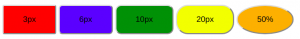
边界半径:
此属性用于设置按钮的边框半径。它设置边框的圆角。
语法如下:
element {
    // border-radius property
}
例子:
<!DOCTYPE html>
< html >

< head >
     < title >
         button border-radius property
     </ title >

     < style >
         .b {
             padding : 15px 32px;
             border : none;
             font-size: 16px;
         }
         .b1 {
             background-color: red;
             border-radius: 3px;
         }
         .b2 {
             background-color: blue;
             border-radius: 6px;
         }
         .b3 {
             background-color: green;
             border-radius: 10px;
         }
         .b4 {
             background-color: yellow;
             border-radius: 20px;
         }
         .b5 {
             background-color: orange;
             border-radius: 50%;
         }
     </ style >
</ head >

< body >
     < button class = "b b1" >3px </ button >
     < button class = "b b2" >6px</ button >
     < button class = "b b3" >10px</ button >
     < button class = "b b4" >20px</ button >
     < button class = "b b5" >50%</ button >
</ body >
</ html >
输出如下:
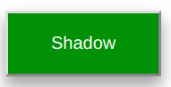
盒子阴影:
此属性用于创建按钮框的阴影。
语法如下:
box-shadow: [horizontal offset] [vertical offset] [blur radius]
            [optional spread radius] [color];
例子:
<!DOCTYPE html>
< html >

< head >
     < title >
         button box-shadow property
     </ title >

     < style >
         .b {
             padding : 15px 32px;
             border : none /* none */
             font-size: 16px;
             color: white;
         }
         .b1 {
             background-color: green;
             box-shadow : 0 8px 16px 0 rgba(0, 0, 0, 0.2), 0 6px 20px 0 rgba(0, 0, 0, 0.19);
         }
     </ style >
</ head >

< body >
     < button class = "b b1" >Shadow 1 </ button >
</ body >
</ html >
输出如下:
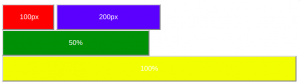
宽度:
此属性用于设置按钮的宽度。
风格:
element {
    // width property
}
例子:
<!DOCTYPE html>
< html >

< head >
     < title >button width property</ title >
     < style >
         .button {
             padding : 15px 32px;
             border : none;
             font-size: 16px;
             color: white;
         }

         .b1 {
             background-color: red;
             width: 100px;
         }
         .b2 {
             background-color: blue;
             width: 200px;
         }
         .b3 {
             background-color: green;
             width: 50%;
         }
         .b4 {
             background-color: yellow;
             width: 100%;
         }
     </ style >
</ head >

< body >
     < button class = "button b1" >100px </ button >
     < button class = "button b2" >200px </ button >
     < button class = "button b3" >50% </ button >
     < button class = "button b4" >100%</ button >
</ body >
</ html >
输出如下:
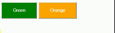
悬停效果:
该属性用于在鼠标移至上方时更改按钮界面。
语法如下:
element:hover {
    // CSS property
}
例子:
<!DOCTYPE html>
< html >

< head >
     < title >button width property</ title >

     < style >
         .button {
             padding : 15px 32px;
             border : none
             font-size: 16px;
             color: white;
             transition-duration: 0.3s;
         }
         .b1 {
             background-color: green;
         }
         .b2 {
             background-color: orange;
         }
         .b1:hover {
             background-color: white;
             color: orange;
         }
         .b2:hover {
             background-color: white;
             color: green;
         }
     </ style >
</ head >

< body >
     < button class = "button b1" >Green </ button >
     < button class = "button b2" >Orange </ button >
</ body >
</ html >
输出如下: