的阴影效果属性CSS中的CSS用于在HTML文档中添加文本和图像阴影。
文字阴影:CSS text-shadow属性用于显示带有阴影的文本。此属性保存阴影的像素长度, 宽度和宽度以及阴影的颜色。
语法如下:
Text-shadow: 3px 3px 3px green;例子:
<!DOCTYPE html>
<html>
<head>
<title>text-shadow property</title>
<style>
h1 {
color: green;
text-shadow: 3px 3px 3px lightgreen;
}
</style>
</head>
<body>
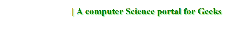
<h1>Geeks For Geeks | A computer Science portal for Geeks</h1>
</body>
</html>输出如下:
文字框阴影:CSS boxShadow属性将阴影应用于文本框。此属性保存阴影的像素长度, 宽度和宽度以及阴影的颜色。
语法如下:
boxShadow: 3px 3px 3px green;例子:
<!DOCTYPE html>
<html>
<head>
<title>box shadow property</title>
<style>
#Gfg {
width: 220px;
height: 50px;
background-color: green;
color: white;
}
</style>
<script>
//function that show Shadow Effect.
function Shadow() {
document.getElementById( "Gfg" ).style.boxShadow
= "5px 5px 5px gray" ;
}
</script>
</head>
<body>
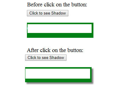
<button onclick = "Shadow()">Click to see Shadow</button>
<div id = "Gfg">
<h1>lsbin</h1>
</div>
</body>
</html>输出如下: