它允许使用3D变换来更改元素。在3D变换中, 元素沿X轴, Y轴和Z轴旋转。
下面列出了三种主要的转换类型:
- rotationX()
- rotationY()
- rotationZ()
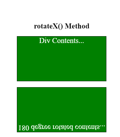
rotationX()方法:
此旋转用于使元素绕X轴旋转给定角度。
例子:
<!DOCTYPE html>
<html>
     <head>
         <title>3D Transformation</title>
         <style>
             .normal_div {
                 width: 300px;
                 height: 150px;
                 color: white;
                 font-size:25px;
                 background-color: green;
                 border: 1px solid black;
                 margin-bottom:20px;
             }

             #rotateX {
                 width: 300px;
                 height: 150px;
                 color: white;
                 font-size:25px;
                 background-color: green;
                 border: 1px solid black;
                 -webkit-transform: rotateX(180deg); /* Safari */
                 transform: rotateX(180deg); /* Standard syntax */

             }
             .gfg {
                 font-size:40px;
                 font-weight:bold;
                 color:#090;
             }
             .geeks {
                 font-size:25px;
                 font-weight:bold;
                 margin:20px 0;
             }
         </style>
     </head>
     <body>
         <center>
             <div class = "gfg">lsbin</div>
             <div class = "geeks">rotateX() Method</div>
             <div class = "normal_div"> Div Contents... </div>
             <div id = "rotateX">180 degree rotated contents...</div>
         </center>
     </body>
</html>
输出如下:
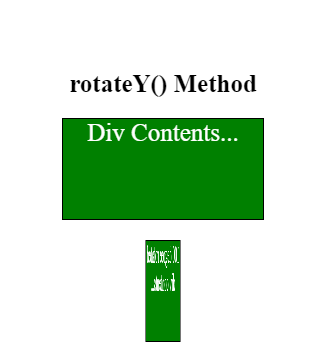
rotationY()方法:
此方法用于以给定的角度绕Y轴旋转元素。
例子:
<!DOCTYPE html>
<html>
     <head>
         <title>3D Transformation</title>
         <style>
             .normal_div {
                 width: 200px;
                 color:white;
                 font-size:25px;
                 height: 100px;
                 background-color: green;
                 border: 1px solid black;
                 margin-bottom:20px;
             }

             #rotateY {
                 width: 200px;
                 color:white;
                 font-size:25px;
                 height: 100px;
                 background-color: green;
                 border: 1px solid black;
                 -webkit-transform: rotateY(180deg); /* Safari */
                 transform: rotateY(100deg); /* Standard syntax */
             }
             .gfg {
                 font-size:40px;
                 font-weight:bold;
                 color:#090;
             }
             .geeks {
                 font-size:25px;
                 font-weight:bold;
                 margin:20px 0;
             }
         </style>
     </head>
     <body>
         <center>
             <div class = "gfg">lsbin</div>
             <div class = "geeks">rotateY() Method</div>
             <div class = "normal_div"> Div Contents... </div>
             <div id = "rotateY">180 degree rotated div contents...</div>
         </center>
     </body>
</html>
输出如下:
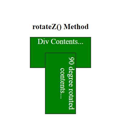
rotationZ()方法:
此方法用于将元素绕Z轴旋转给定角度。
例子:
<!DOCTYPE html>
<html>
     <head>
         <title>3D Transformation</title>
         <style>
             .normal_div {
                 width: 200px;
                 height: 100px;
                 font-size:25px;
                 color:white;
                 background-color: green;
                 border: 1px solid black;
             }

             #rotateZ {
                 width: 200px;
                 height: 100px;
                 color:white;
                 font-size:25px;
                 background-color: green;
                 border: 1px solid black;
                 -webkit-transform: rotateZ(90deg); /* Safari */
                 transform: rotateZ(90deg); /* Standard syntax */
             }
             .gfg {
                 font-size:40px;
                 font-weight:bold;
                 color:#090;
             }
             .geeks {
                 font-size:25px;
                 font-weight:bold;
                 margin:20px 0;
             }
         </style>
     </head>
     <body>
         <center>
             <div class = "gfg">lsbin</div>
             <div class = "geeks">rotateZ() Method</div>
             <div class = "normal_div"> Div Contents... </div>
             <div id = "rotateZ">90 degree rotated contents...</div>
         </center>
     </body>
</html>
输出如下: