Materialize CSS提供了各种类来使媒体响应。
图片:图像可以通过以下方式设置样式:
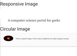
响应式图片:为了使图像响应页面宽度, 响应式img类添加了图像标签。
<img class="responsive-img" src="image.jpg" alt="Materialize CSS如何使用媒体?">圆形图片:为了使图像看起来呈圆形, 圈类添加了图像标签。
<div class="col s12 m8 offset-m2 l6 offset-l3">
  <div class="card-panel grey lighten-5 z-depth-1">
    <div class="row valign-wrapper">
      <div class="col s2">
        <img src="image.jpg" alt="Materialize CSS如何使用媒体?"
          class="circle responsive-img">
      </div>
      <div class="col s10">
        <span class="black-text">
          This is a square image, "circle"
          class is added to it to make it
          appear circular.
        </span>
      </div>
    </div>
  </div>
</div>
例子:
<!DOCTYPE html>
< html >
   < head >
     <!--Import Google Icon Font-->
     < link href =
"https://fonts.googleapis.com/icon?family=Material+Icons"
           rel = "stylesheet" >

     <!-- Compiled and minified CSS -->
     < link rel = "stylesheet" href =
"https://cdnjs.cloudflare.com/ajax/libs/materialize/0.97.5/css/materialize.min.css" >

     < script type = "text/javascript"
          src =
"https://code.jquery.com/jquery-2.1.1.min.js" >
</ script >

     <!--Let browser know website is optimized for mobile-->
     < meta name = "viewport"
           content = "width=device-width, initial-scale=1.0" />
   </ head >

   < body >
       < div >
           < h3 >Responsive Image</ h3 >
         < img class = "responsive-img"
              src = "lsbin-6.png" >
       </ div >

     < div class = "col s12 m8 offset-m2 l6 offset-l3" >
         < h3 >Circular Image</ h3 >
         < div class = "card-panel grey lighten-5 z-depth-1" >
           < div class = "row valign-wrapper" >
             < div class = "col s2" >
               < img src = "download.jpg"
                    class = "circle responsive-img" >
                <!-- notice the "circle" class -->
             </ div >
             < div class = "col s10" >
               < span class = "black-text" >
                 This is a square image, "circle" class is added
                 to it to make it appear
                 circular.
               </ span >
             </ div >
           </ div >
         </ div >
       </ div >

      <!-- Compiled and minified JavaScript -->
      < script src =
"https://cdnjs.cloudflare.com/ajax/libs/materialize/0.97.5/js/materialize.min.js" >
     </ script >
   </ body >
</ html >
输出如下:
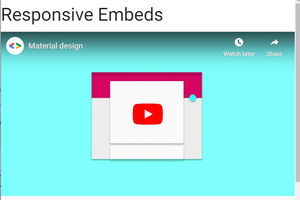
视频:Materialize CSS为嵌入式视频提供了一个可调整大小的容器。
响应式嵌入:为了使嵌入响应, 只需将它们包装在具有类video-container的div中。
<div class="video-container">
<iframe width="853" height="480"
src="//www.youtube.com"
frameborder="0"
allowfullscreen>
</iframe>
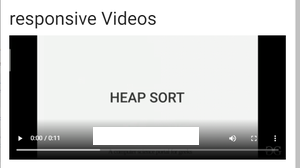
</div>响应视频:要使HTML5视频具有响应性, 只需将响应视频类添加到video标签。
<video class="responsive-video" controls>
    <source src="video.mp4" type="video/mp4">
</video>
例子:
<!DOCTYPE html>
< html >

< head >
     <!--Import Google Icon Font-->
     < link href =
"https://fonts.googleapis.com/icon?family=Material+Icons"
         rel = "stylesheet" >

     <!-- Compiled and minified CSS -->
     < link rel = "stylesheet" href =
"https://cdnjs.cloudflare.com/ajax/libs/materialize/0.97.5/css/materialize.min.css" >

     < script type = "text/javascript"
src = "https://code.jquery.com/jquery-2.1.1.min.js" >
     </ script >

     <!--Let browser know website
         is optimized for mobile-->
     < meta name = "viewport" content=
                     " width = device -width, initial-scale = 1 .0" />
</ head >

< body >
     < div >
         < h3 >Responsive Embeds</ h3 >
         < div class = "video-container" >
             < iframe width = "853" height = "480"
src = "//www.youtube.com/embed/Q8TXgCzxEnw?rel=0"
                 frameborder = "0"
                 allowfullscreen>
             </ iframe >
         </ div >
     </ div >


     < div class = "card-panel" >
         < h3 >responsive Videos</ h3 >
         < video class = "responsive-video"
             controls>
             < source src =
"WhatsApp Video 2020-06-02 at 13.23.30.mp4"
             type = "video/mp4" >
         </ video >
     </ div >


     <!-- Compiled and minified JavaScript -->
     < script src =
"https://cdnjs.cloudflare.com/ajax/libs/materialize/0.97.5/js/materialize.min.js" >
     </ script >
</ body >

</ html >
输出如下: