它也被称为弹性盒子模型。它基本上是一个布局模型,提供了一种简单而干净的方式来安排容器内的项目。Flexbox不同于垂直偏置的块型和水平偏置的直列型。Flexbox是为小规模布局而创建的,还有另一个标准叫做grid,它更倾向于大规模布局,它的工作方式类似于Twitter bootstrap grid系统的工作方式。flex响应灵敏,移动友好。要使用flex,首先创建一个flex容器。若要创建flex容器,请将display属性设置为flex。
例子:
.main-container {
  display: flex;
}
弹性属性:
- flex-direction
- flex-wrap
- flex-flow
- justify-content
- align-items
- align-content
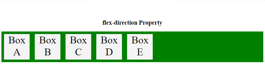
flex-direction:flex-direction用于定义弹性物品的方向。在flexbox中, 默认轴为水平轴, 因此项目将排成一行。
语法如下:
// Stacking flex items column wise
flex-direction: column;

// Stacking flex items from bottom to top
flex-direction: column-reverse;

// Stacking flex items row wise
flex-direction: row;

// Stacking flex items from right to left
flex-direction: row-reverse;
例子:
<!DOCTYPE html>
< html >
     < head >
         < title >flexbox</ title >
         < style >
             .gfg_flex {
                 display: flex;
                 flex-direction: row;
                 background-color: green;
                 text-align:center;
             }

             .gfg_flex > div {
                 background-color: #f4f4f4;
                 width: 100px;
                 height:100px;
                 margin: 10px;
                 font-size: 40px;
             }
             h2 {
                 text-align:center;
             }
             .geeks {
                 font-size:40px;
                 text-align:center;
                 color:#009900;
                 font-weight:bold;
             }
         </ style >
     </ head >
     < body >
         < div class = "geeks" >lsbin</ div >
         < h2 >flex-direction Property</ h2 >
         < div class = "gfg_flex" >
             < div >Box A</ div >
             < div >Box B</ div >
             < div >Box C</ div >
             < div >Box D</ div >
             < div >Box E</ div >
         </ div >
     </ body >
</ html >
输出如下:
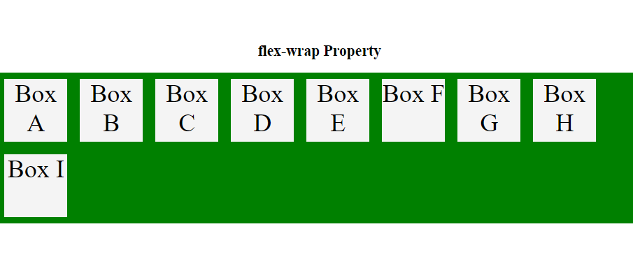
flex-wrap:flex-wrap属性用于定义flex-item的包装。如果将flex-wrap属性设置为wrap, 则在浏览器的窗口中设置该框。如果浏览器窗口小于元素, 则元素下降到下一行。
语法如下:
// Wrap flex items when necessary
flex-wrap: wrap;

// Flex items will not wrap
flex-wrap: nowrap;
例子:
<!DOCTYPE html>
< html >
     < head >
         < title >flex-wrap property</ title >
         < style >
             .gfg_flex {
                 display: flex;
                 flex-wrap: wrap;
                 text-align:center;
                 background-color: green;
             }

             .gfg_flex > div {
                 background-color: #f4f4f4;
                 width: 100px;
                 height:100px;
                 margin: 10px;
                 font-size: 40px;
             }
             h2 {
                 text-align:center;
             }
             .geeks {
                 font-size:40px;
                 text-align:center;
                 color:#009900;
                 font-weight:bold;
             }
         </ style >
     </ head >
     < body >
         < div class = "geeks" >lsbin</ div >
         < h2 >flex-wrap Property</ h2 >
         < div class = "gfg_flex" >
             < div >Box A</ div >
             < div >Box B</ div >
             < div >Box C</ div >
             < div >Box D</ div >
             < div >Box E</ div >
             < div >Box F</ div >
             < div >Box G</ div >
             < div >Box H</ div >
             < div >Box I</ div >
         </ div >
     </ body >
</ html >
输出如下:
注意:
flex-flow是flex-direction和flex-wrap的简写。
语法如下:
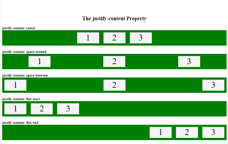
flex-flow: row wrap;justify-content:justify-content属性用于根据flexbox容器内的主轴对齐flex项目。
语法如下:
// Aligns the flex items at the center
justify-content: center;

// The space is distributed around the flexbox items
//and it also adds space before the first item and after the last one.
justify-content: space-around;

// Space between the lines
justify-content: space-between;

// Aligns the flex items at the beginning of the container
justify-content: flex-start;

// Aligns the flex items at the end of the container
justify-content: flex-end;
例子:
<!DOCTYPE html>
< html >
     < head >
         < title >justify flexbox property</ title >
         < style >
             .flex1 {
                 display: flex;
                 justify-content: center;
                 background-color: green;
             }

             .flex2 {
                 display: flex;
                 justify-content: space-around;
                 background-color: green;
             }

             .flex3 {
                 display: flex;
                 justify-content: space-between;
                 background-color: green;
             }

             .flex4 {
                 display: flex;
                 justify-content: flex-start;
                 background-color: green;
             }

             .flex5 {
                 display: flex;
                 justify-content: flex-end;
                 background-color: green;
             }

             .flex-items {
                 background-color: #f4f4f4;
                 width: 100px;
                 height:50px;
                 margin: 10px;
                 text-align: center;
                 font-size: 40px;
             }
             h2 {
                 text-align:center;
             }
             .geeks {
                 font-size:40px;
                 text-align:center;
                 color:#009900;
                 font-weight:bold;
             }
         </ style >
     </ head >
     < body >
         < div class = "geeks" >lsbin</ div >
         < h2 >The justify-content Property</ h2 >
         < b >justify-content: center </ b >
         < div class = "flex1" >
             < div class = "flex-items" >1</ div >
             < div class = "flex-items" >2</ div >
             < div class = "flex-items" >3</ div >
         </ div >
         < br >
         < b >justify-content: space-around </ b >
         < div class = "flex2" >
             < div class = "flex-items" >1</ div >
             < div class = "flex-items" >2</ div >
             < div class = "flex-items" >3</ div >
         </ div >
         < br >
         < b >justify-content: space-between </ b >
         < div class = "flex3" >
             < div class = "flex-items" >1</ div >
             < div class = "flex-items" >2</ div >
             < div class = "flex-items" >3</ div >
         </ div >
         < br >
         < b >justify-content: flex-start </ b >
         < div class = "flex4" >
             < div class = "flex-items" >1</ div >
             < div class = "flex-items" >2</ div >
             < div class = "flex-items" >3</ div >
         </ div >
         < br >
         < b >justify-content: flex-end </ b >
         < div class = "flex5" >
             < div class = "flex-items" >1</ div >
             < div class = "flex-items" >2</ div >
             < div class = "flex-items" >3</ div >
         </ div >
     </ body >
</ html >
输出如下:
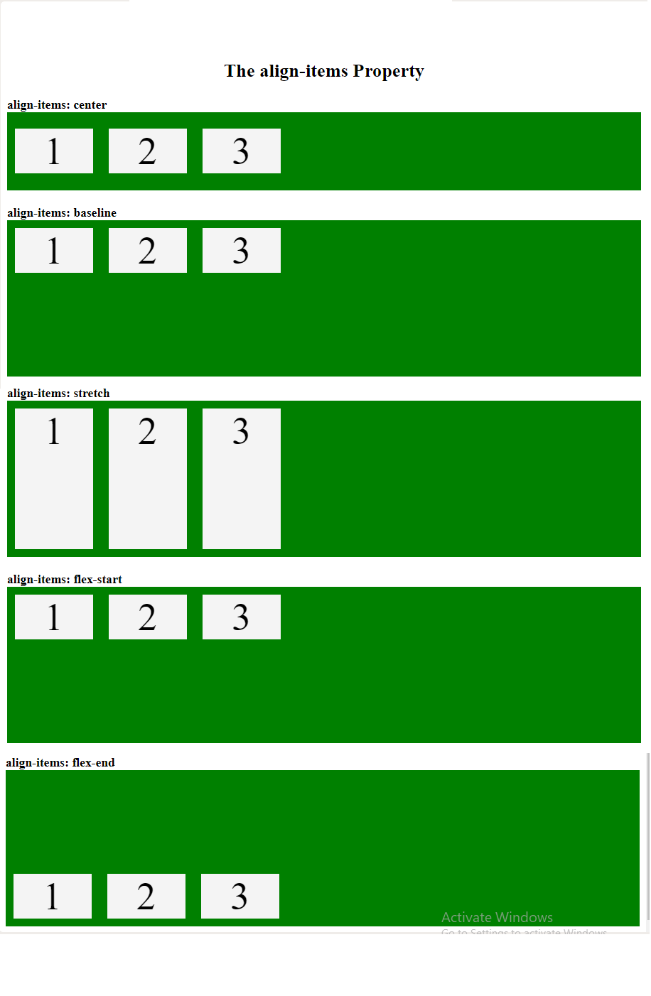
align-items:此属性用于根据交叉轴垂直对齐弹性项目。
语法如下:
// Aligns the flex items in the middle of the container
align-items: center;

// Flexbox items are aligned at the baseline of the cross axis
align-items: baseline;

// Stretches the flex items
 align-items: stretch;

// Aligns the flex items at the top of the container
align-items: flex-start;

// Aligns elements at the bottom of the container
align-items: flex-end;
例子:
<!DOCTYPE html>
< html >
     < head >
         < title >align-items property</ title >
         < style >
             .flex1 {
                 display: flex;
                 height: 200px;
                 align-items: center;
                 background-color: green;
             }

             .flex2 {
                 display: flex;
                 height: 200px;
                 align-items: baseline;
                 background-color: green;
                 }

             .flex3 {
                 display: flex;
                 height: 200px;
                 align-items: stretch;
                 background-color: green;
             }

             .flex4 {
                 display: flex;
                 height: 200px;
                 align-items: flex-start;
                 background-color: green;
             }

             .flex5 {
                 display: flex;
                 height: 200px;
                 align-items: flex-end;
                 background-color: green;
             }

             .flex-items {
                 background-color: #f4f4f4;
                 width: 100px;
                 margin: 10px;
                 text-align: center;
                 font-size: 50px;
             }
             h2 {
                 text-align:center;
             }
             .geeks {
                 font-size:40px;
                 text-align:center;
                 color:#009900;
                 font-weight:bold;
             }
         </ style >
     </ head >
     < body >
     < div class = "geeks" >lsbin</ div >
     < h2 >The align-items Property</ h2 >
     < b >align-items: center </ b >
     < div class = "flex1" >
         < div class = "flex-items" >1</ div >
         < div class = "flex-items" >2</ div >
         < div class = "flex-items" >3</ div >
     </ div >
     < br >
     < b >align-items: baseline </ b >
     < div class = "flex2" >
         < div class = "flex-items" >1</ div >
         < div class = "flex-items" >2</ div >
         < div class = "flex-items" >3</ div >
     </ div >
     < br >
     < b >align-items: stretch </ b >
     < div class = "flex3" >
         < div class = "flex-items" >1</ div >
         < div class = "flex-items" >2</ div >
         < div class = "flex-items" >3</ div >
     </ div >
     < br >
     < b >align-items: flex-start </ b >
     < div class = "flex4" >
         < div class = "flex-items" >1</ div >
         < div class = "flex-items" >2</ div >
         < div class = "flex-items" >3</ div >
     </ div >
     < br >
     < b >align-items: flex-end </ b >
     < div class = "flex5" >
         < div class = "flex-items" >1</ div >
         < div class = "flex-items" >2</ div >
         < div class = "flex-items" >3</ div >
     </ div >
     </ body >
</ html >
输出如下:
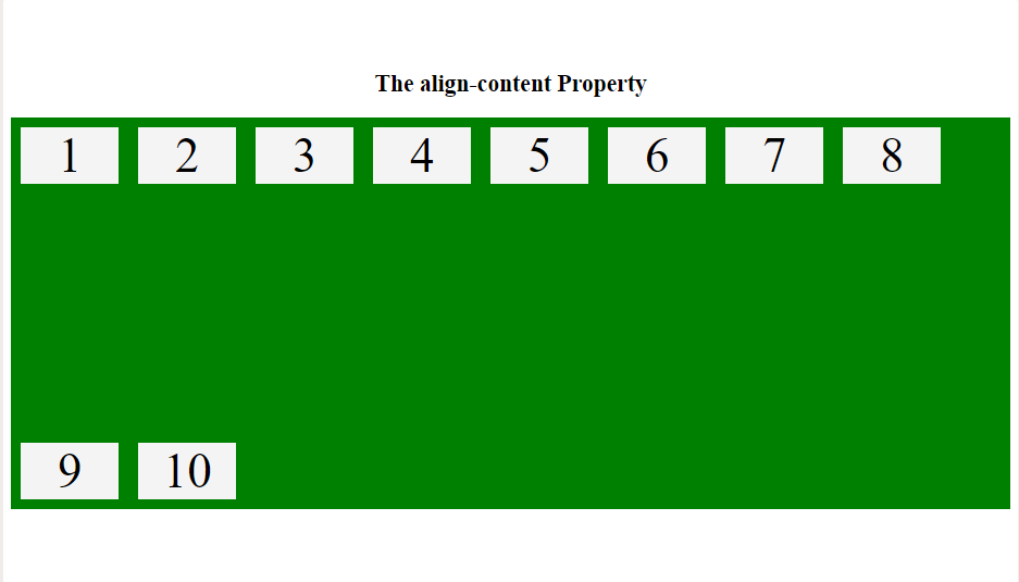
align-content:此属性定义了flexbox中每个flex行的对齐方式, 并且仅在应用flex-wrap:wrap时, 即存在多行flexbox项目时才适用。
语法如下 :
// Displays the flex lines with equal space between them
align-content: space-between;

// Displays the flex lines at the start of the container
align-content: flex-start;

// Displays the flex lines at the end of the container
 align-content: flex-end;

// Dy using space-around property space will be
// Distributed equally around the flex lines
align-content: space-around;

// Stretches the flex lines
align-content: stretch;
例子:
<!DOCTYPE html>
< html >
     < head >
         < title >align-content property</ title >
         < style >
             .main-container {
                 display: flex;
                 height: 400px;
                 flex-wrap: wrap;
                 align-content: space-between;
                 background-color: green;
             }

             .main-container div {
                 background-color: #f4f4f4;
                 width: 100px;
                 margin: 10px;
                 text-align: center;
                 font-size: 50px;
             }
             h2 {
                 text-align:center;
             }
             .geeks {
                 font-size:40px;
                 text-align:center;
                 color:#009900;
                 font-weight:bold;
             }
         </ style >
     </ head >
     < body >
         < div class = "geeks" >lsbin</ div >
         < h2 >The align-content Property</ h2 >
         < div class = "main-container" >
             < div >1</ div >
             < div >2</ div >
             < div >3</ div >
             < div >4</ div >
             < div >5</ div >
             < div >6</ div >
             < div >7</ div >
             < div >8</ div >
             < div >9</ div >
             < div >10</ div >
         </ div >
     </ body >
</ html >
输出如下: