本文概述
有三种方法可以解决此问题:
- 默认情况下
- 使用内联块属性
- 在width和height中使用fit-content属性
默认情况
在HTML div中, 默认情况下适合其中的内容。该示例如下所示:
范例1:
<!DOCTYPE html>
< html lang = "en" dir = "ltr" >
< head >
< meta charset = "utf-8" >
< title >Geeks for Geeks Example</ title >
<!--CSS Code-->
< style media = "screen" >
body {
background: orange;
overflow: hidden;
color: white;
}
.lsbin {
background: dodgerblue;
position: absolute;
top: 50%;
left: 1%;
right: 1%;
}
</ style >
</ head >
< body >
<!-- HTML Code -->
< center >< h1 style = "color:forestgreen ; top:35% ; left: 35% ;
position:absolute; ">Geeks For Geeks</ h1 ></ center >
< center >
< div class = "lsbin" >
Lorem ipsum dolor sit amet, consectetur adipisicing elit, sed do eiusmod
tempor incididunt ut labore et dolore magna aliqua. Ut enim ad minim
veniam, quis nostrud exercitation ullamco laboris nisi ut aliquip ex ea
commodo consequat. Duis aute irure dolor in reprehenderit in voluptate
velit esse cillum dolore eu fugiat nulla pariatur. Excepteur sint
occaecat cupidatat non proident, sunt in culpa qui officia deserunt
mollit anim id est laborum.
</ div >
</ center >
</ body >
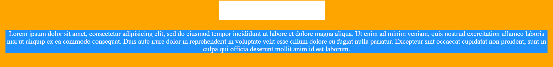
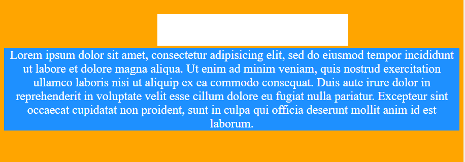
</ html >输出如下:
显示了两个不同屏幕宽度的输出, 证明了它适合其中的内容。
屏幕1:
屏幕2:
使用内联块属性
使用display:inline-block属性可根据其内容设置div大小。
范例2:
<!DOCTYPE html>
< html lang = "en" dir = "ltr" >
< head >
< meta charset = "utf-8" >
< title >Geeks for Geeks Example</ title >
<!--CSS Code-->
< style media = "screen" >
body {
background: violet;
overflow: auto;
color: white;
}
.lsbin {
background: dodgerblue;
position: absolute;
display: inline-block;
left: 1%;
right: 1%;
top: 50%;
}
</ style >
</ head >
< body >
<!-- HTML Code -->
< center >< h1 style="color: forestgreen; top: 35%; left: 35%;
position: absolute;">Geeks For Geeks</ h1 ></ center >
< center >
< div class = "lsbin" >
Lorem ipsum dolor sit amet, consectetur adipisicing elit, sed do eiusmod
tempor incididunt ut labore et dolore magna aliqua. Ut enim ad minim
veniam, quis nostrud exercitation ullamco laboris nisi ut aliquip ex ea
commodo consequat. Duis aute irure dolor in reprehenderit in voluptate
velit esse cillum dolore eu fugiat nulla pariatur. Excepteur sint
occaecat cupidatat non proident, sunt in culpa qui officia deserunt
mollit anim id est laborum.
</ div >
</ center >
</ body >
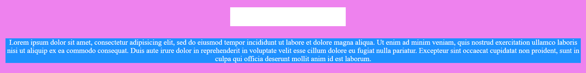
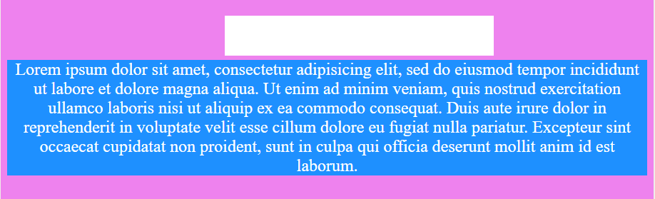
</ html >输出如下:
显示了两个不同屏幕宽度的输出, 证明了它适合其中的内容。
屏幕1:
屏幕2:
在width和height中使用fit-content属性
在此方法中, 我们将width和height属性设置为fit-content值。
范例3:
<!DOCTYPE html>
< html lang = "en" dir = "ltr" >
< head >
< meta charset = "utf-8" >
< title >Geeks for Geeks Example</ title >
<!--CSS Code-->
< style media = "screen" >
body {
background: tomato;
overflow: hidden;
color: white;
}
.lsbin {
background: crimson;
position: absolute;
width:fit-content;
height:fit-content;
left: 0;
top: 50%;
}
</ style >
</ head >
< body >
<!-- HTML Code -->
< center >< h1 style = "color: lime; top: 35%; left: 35%;
position: absolute;">Geeks For Geeks</ h1 ></ center >
< center >
< div class = "lsbin" >
Lorem ipsum dolor sit amet, consectetur adipisicing elit, sed do eiusmod
tempor incididunt ut labore et dolore magna aliqua. Ut enim ad minim
veniam, quis nostrud exercitation ullamco laboris nisi ut aliquip ex ea
commodo consequat. Duis aute irure dolor in reprehenderit in voluptate
velit esse cillum dolore eu fugiat nulla pariatur. Excepteur sint
occaecat cupidatat non proident, sunt in culpa qui officia deserunt
mollit anim id est laborum.
</ div >
</ center >
</ body >
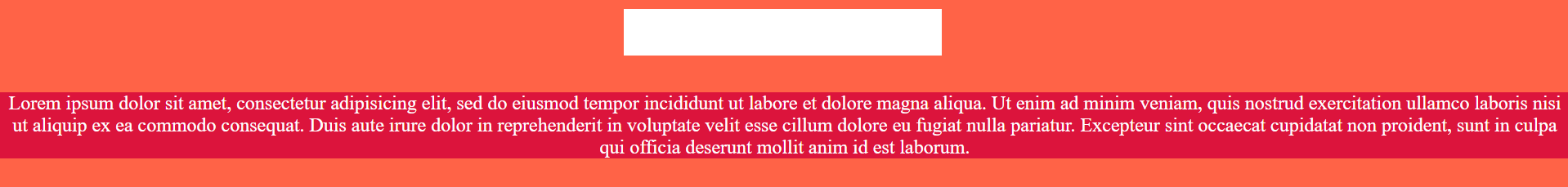
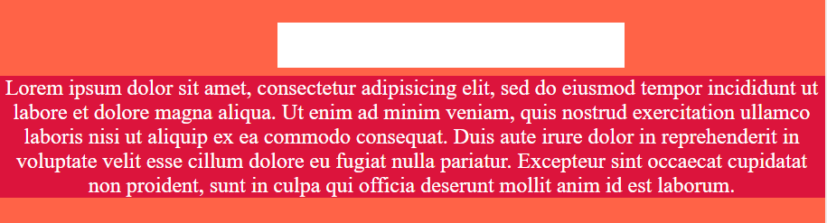
</ html >输出如下:
显示了两个不同屏幕宽度的输出, 证明了它适合其中的内容。
屏幕1:
屏幕2: