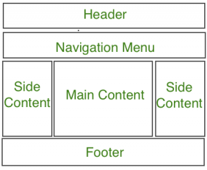
网站可以分为多个部分, 包括标题, 菜单, 内容和页脚, 基于这些部分, 开发人员可以使用许多不同的布局设计。可以使用div标签创建不同的布局, 并使用CSS属性对其进行样式设置。
网站布局的最常见结构如下:
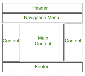
注意:标头部分包含网站徽标, 搜索栏和用户个人资料。导航菜单包含指向各种可用文章类别的链接, 内容部分分为3个部分(列), 左右侧边栏包含与其他文章和广告的链接, 而主要内容部分是包含该文章的部分, 然后在底部页脚部分包含地址, 链接, 联系人等。
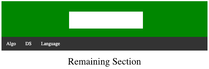
标头部分:标头部分通常位于网站顶部或顶部导航菜单下方。它通常包含网站名称或网站徽标。
例子:
<!-- This code describes the header section
of website layout -->
<!DOCTYPE html>
< html >
     < head >
         < title >
             Website Layouts
         </ title >

         < style >
             .header {
                 background-color: green;
                 padding: 15px;
                 text-align: center;
             }
         </ style >
     </ head >

     < body >
         < div class = "header" >
             < h2 style = "color:white;" >
                 lsbin
             </ h2 >
         </ div >
         < br >

         < center style = "font-size:200%;" >
             Remaining Section
         </ center >
     </ body >
</ html >
输出如下:

导航菜单:导航栏/菜单基本上是链接列表, 它使访问者可以轻松访问并轻松浏览网站。
例子:
<!DOCTYPE html>
< html >
     < head >
         < title >
             Website Layout
         </ title >

         < style >

             /* CSS property for header section */
             .header {
                 background-color: green;
                 padding: 15px;
                 text-align: center;
             }

             /* CSS property for nevigation menu */
             .nav_menu {
                 overflow: hidden;
                 background-color: #333;
             }
             .nav_menu a {
                 float: left;
                 display: block;
                 color: white;
                 text-align: center;
                 padding: 14px 16px;
                 text-decoration: none;
             }
             .nav_menu a:hover {
                 background-color: white;
                 color: green;
             }
         </ style >
     </ head >

     < body >

         <!-- header of website layout -->
         < div class = "header" >
             < h2 style = "color:white;font-size:200%;" >
                 lsbin
             </ h2 >
         </ div >

         <!-- nevigation menu for website layout -->
         < div class = "nav_menu" >
             < a href = "#" >Algo</ a >
             < a href = "#" >DS</ a >
             < a href = "#" >Language</ a >
         </ div >< br >

         < center style = "font-size:200%;" >
             Remaining Section
         </ center >
     </ body >
</ html >
输出如下:
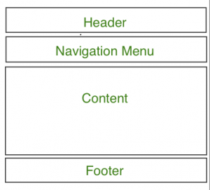
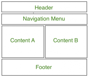
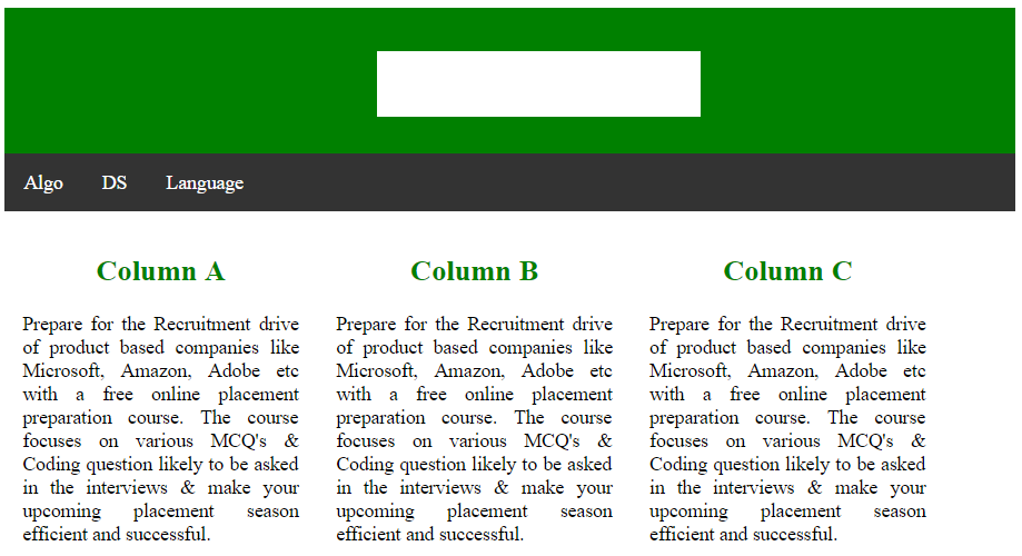
内容部分:
内容部分是网站的主体。用户可以按n列布局划分内容部分。
最常见的布局是:
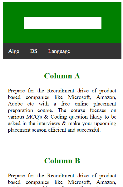
一栏布局:
它主要用于移动布局。
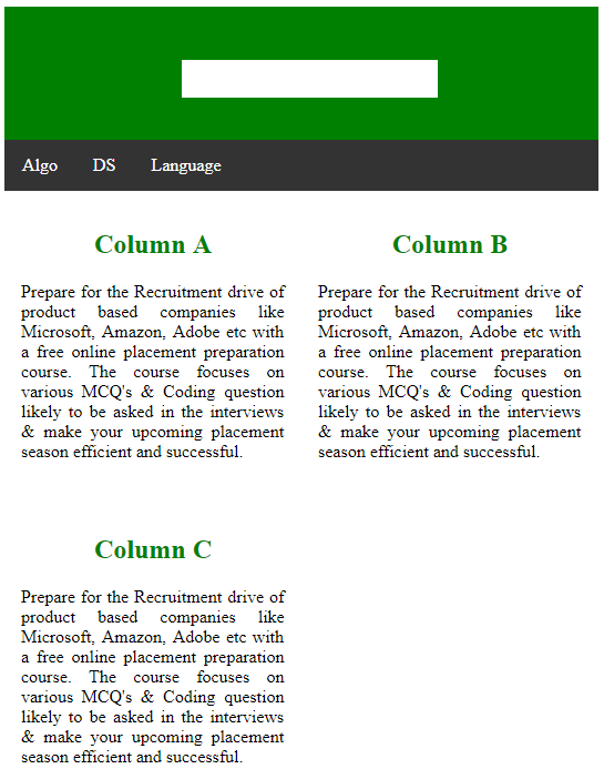
2列布局:
该网站布局主要用于平板电脑或笔记本电脑。
3列布局:
该网站布局主要用于台式机。
用户还可以创建一个响应式布局, 该布局将根据屏幕大小进行更改。考虑下面的示例, 如果屏幕的宽度大于600px, 则将有3列布局;如果屏幕的宽度在400px至600px之间, 则将有2列布局;如果屏幕尺寸小于400px, 则有1列将显示布局。
例子:
<!DOCTYPE html>
< html >
     < head >
         < title >
             Website Layout
         </ title >
         < style >
             * {
                 box-sizing: border-box;
             }

             /* CSS property for header section */
             .header {
                 background-color: green;
                 padding: 15px;
                 text-align: center;
             }

             /* CSS property for nevigation menu */
             .nav_menu {
                 overflow: hidden;
                 background-color: #333;
             }
             .nav_menu a {
                 float: left;
                 display: block;
                 color: white;
                 text-align: center;
                 padding: 14px 16px;
                 text-decoration: none;
             }
             .nav_menu a:hover {
                 background-color: white;
                 color: green;
             }

             /* CSS property for content section */
             .columnA, .columnB, .columnC {
                 float: left;
                 width: 31%;
                 padding: 15px;
                 text-align:justify;
             }
             h2 {
                 color:green;
                 text-align:center;
             }

             /* Media query to set website layout
             according to screen size */
             @media screen and (max-width:600px) {
                 .columnA, .columnB, .columnC {
                     width: 50%;
                 }
             }
             @media screen and (max-width:400px) {
                 .columnA, .columnB, .columnC {
                     width: 100%;
                 }
             }
         </ style >
     </ head >

     < body >

         <!-- header of website layout -->
         < div class = "header" >
             < h2 style = "color:white;font-size:200%" >
                 lsbin
             </ h2 >
         </ div >

         <!-- nevigation menu of website layout -->
         < div class = "nav_menu" >
             < a href = "#" >Algo</ a >
             < a href = "#" >DS</ a >
             < a href = "#" >Language</ a >
         </ div >

         <!-- Content section of website layout -->
         < div class = "row" >

             < div class = "columnA" >
                 < h2 >Column A</ h2 >
                 < p >Prepare for the Recruitment drive of product
                 based companies like Microsoft, Amazon, Adobe
                 etc with a free online placement preparation
                 course. The course focuses on various MCQ's
                 & Coding question likely to be asked in the
                 interviews & make your upcoming placement
                 season efficient and successful.</ p >
             </ div >

             < div class = "columnB" >
                 < h2 >Column B</ h2 >
                 < p >Prepare for the Recruitment drive of product
                 based companies like Microsoft, Amazon, Adobe
                 etc with a free online placement preparation
                 course. The course focuses on various MCQ's
                 & Coding question likely to be asked in the
                 interviews & make your upcoming placement
                 season efficient and successful.</ p >
             </ div >

             < div class = "columnC" >
                 < h2 >Column C</ h2 >
                 < p >Prepare for the Recruitment drive of product
                 based companies like Microsoft, Amazon, Adobe
                 etc with a free online placement preparation
                 course. The course focuses on various MCQ's
                 & Coding question likely to be asked in the
                 interviews & make your upcoming placement
                 season efficient and successful.</ p >
             </ div >
         </ div >
     </ body >
</ html >
输出如下:
屏幕尺寸的宽度大于700像素:
屏幕尺寸的宽度大于400像素, 小于600像素:
屏幕尺寸的宽度小于400px:
页脚部分:页脚部分位于网页的底部, 通常由联系信息, 版权, 关于我们等信息组成。
例子:
<!DOCTYPE html>
< html >
     < head >
         < title >
             CSS Website Layout
         </ title >

         < style >

             /* Style for footer section */
             .footer {
                 background-color: green;
                 padding: 15px;
                 text-align: center;
             }
         </ style >
     </ head >

     < body >
         < center style = "font-size:200%;" >
             Upper section
         </ center >

         <!-- footer Section -->
         < div class = "footer" >
             < a href = "#" >About</ a >< br >
             < a href = "#" >Career</ a >< br >
             < a href = "#" >Contact Us</ a >
         </ div >
     </ body >
</ html >
输出如下:
