在本文中,你将学习如何使用纯 CSS 中的打字机效果使你网站的文本变得动态且更具吸引力。
打字机效果涉及逐渐显示文本,就好像它在你眼前打字一样。
将打字机效果添加到你的文本块中可以帮助吸引你网站的访问者并让他们对进一步阅读感兴趣。打字机效果可用于多种用途,例如制作引人入胜的登录页面、号召性用语元素、个人网站和代码演示。
打字机效果很容易创造
如何创建CSS打字机效果?打字机效果很容易制作,为了理解本教程,你所需要的只是 CSS 和 CSS 动画的基本知识。
这是打字机效果的工作方式:
- 打字机动画将通过使用 CSS
steps()函数逐步将宽度从 0 更改为 100% 来显示我们的文本元素。 - 闪烁动画将使“打出”文本的光标动起来。
为我们的打字效果创建网页
CSS打字机效果创建方法:让我们首先为打字机演示创建网页。它将包含一个<div>用于我们的打字机文本的容器,其类为typed-out:
<!doctype html>
<html>
  <head>
    <title>Typewriter effect</title>
    <style>
      body{
        background: navajowhite;
        background-size: cover;
        font-family: 'Trebuchet MS', sans-serif;
      }
  </style>
  </head>
  <body>
    <div class="container">
      <div class="typed-out">Web Developer</div>
    </div>
  </body>
</html>
样式化打字机文本的容器
CSS打字机效果实现实例:现在我们有了网页的布局,让我们<div>用“typed-out”类来设置样式:
.typed-out {
  overflow: hidden;
  border-right: .15em solid orange;
  font-size: 1.6rem;
  width: 0;
}
请注意,为了使打字机效果起作用,我们添加了以下内容:
"overflow: hidden;"和 a"width: 0;", 以确保在打字效果开始之前不会显示文本内容。"border-right: .15em solid orange;", 创建打字机光标。
在制作打字效果之前,为了在typed-out元素完全输入后将光标停在元素的最后一个字母上,就像打字机(或真正的文字处理器)那样,我们将为typed-out元素创建一个容器,然后添加display: inline-block;:
.container {
  display: inline-block;
}
制作 Reveal-text 动画
如何创建CSS打字机效果?打字机动画将一个typed-out字母一个字母地创建元素内部文本的效果。我们将使用@keyframesCSS 动画规则:
@keyframes typing {
  from { width: 0 }
  to { width: 100% }
}
如你所见,此动画所做的只是将元素的宽度从 0 更改为 100%。
现在,我们将这个动画包含在我们的typed-out类中,并将其动画方向设置forwards为确保文本元素width: 0在动画完成后不会返回:
.typed-out{
    overflow: hidden;
    border-right: .15em solid orange;
    white-space: nowrap;
    font-size: 1.6rem;
    width: 0;
    animation: typing 1s forwards;
}
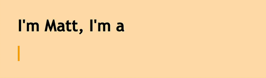
我们的文本元素将在一个平滑的步骤中简单地显示出来,从左到右:
HTML:
<h1>I'm Matt, I'm a</h1>
<div class="container">
  <div class="typed-out">Web Developer</div></div>
CSS:
body{
  background: navajowhite;
  background-size: cover;
  font-family: 'Trebuchet MS', sans-serif;
}
.container{
  display: inline-block;
}
.typed-out{
  overflow: hidden;
  border-right: .15em solid orange;
  white-space: nowrap;
  animation:
    typing 1s forwards;
  font-size: 1.6rem;
  width: 0;
}
@keyframes typing {
  from { width: 0 }
  to { width: 100% }
}
添加实现打字机效果的步骤
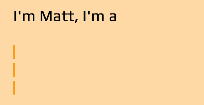
到目前为止,我们的文本已经显示出来,但不是一个字母一个字母地显示文本。这是一个开始,但显然这不是打字机效果的样子。
CSS打字机效果实现实例:为了让这个动画一个字母一个字母地显示我们的文本元素,或者像打字机那样按步骤显示,我们需要typing将typed-out类包含的动画分成几个步骤,以便它看起来像是被打出来的。这就是steps()CSS 函数的用武之地:
.typed-out{
  overflow: hidden;
  border-right: .15em solid orange;
  white-space: nowrap;
  font-size: 1.6rem;
  width: 0;
  animation:
    typing 1s steps(20, end) forwards;
}
如你所见,我们typing使用 CSSsteps()函数将动画分成 20 个步骤。这是我们现在看到的:
HTML:
<h1>I'm Matt, I'm a</h1>
<div class="container">
  <div class="typed-out">Web Developer</div></div>
CSS:
body{
  background: navajowhite;
  background-size: cover;
  font-family: 'Trebuchet MS', sans-serif;
}
.container{
  display: inline-block;
}
.typed-out{
  overflow: hidden;
  border-right: .15em solid orange;
  white-space: nowrap;
  animation:
  typing 1s steps(20, end) forwards;
  font-size: 1.6rem;
  width: 0;
}
@keyframes typing {
  from { width: 0 }
  to { width: 100% }
}
到目前为止,这是我们的完整代码:
<html>
  <head>
    <title>Typewriter effect</title>
  </head>
  <style>
    body{
      background: navajowhite;
      background-size: cover;
      font-family: 'Trebuchet MS', sans-serif;
    }
    .container{
      display: inline-block;
    }
    .typed-out{
      overflow: hidden;
      border-right: .15em solid orange;
      white-space: nowrap;
      animation:
      typing 1s steps(20, end) forwards;
      font-size: 1.6rem;
      width: 0;
    }
    @keyframes typing {
      from { width: 0 }
      to { width: 100% }
    }
  </style>
<body>
<h1>I'm Matt, I'm a</h1>
<div class="container">
  <div class="typed-out">Web Developer</div>
</div>
</body>
</html>
调整步骤以获得更长的打字效果
CSS打字机效果创建方法:要调整较长的文本片段,你需要增加打字动画的步骤和持续时间:
HTML:
<h1>I'm Matt, I'm a</h1>
<div class="container">
  <div class="typed-out">a web developer making unique web apps and designs</div></div>
CSS:
body{
  background: navajowhite;
  background-size: cover;
  font-family: 'Trebuchet MS', sans-serif;
}
.container{
  display: inline-block;
}
.typed-out{
  overflow: hidden;
  border-right: .15em solid orange;
  white-space: nowrap;
  animation: typing 2.5s steps(50, end) forwards;
  font-size: 1.6rem;
  width: 0;
}
@keyframes typing {
  from { width: 0 }
  to { width: 100% }
}
调整步骤以获得更短的打字效果
如何创建CSS打字机效果?要调整较短的文本片段,你需要减少打字动画的步骤和持续时间:
HTML:
<h1>I'm Matt, I'm a</h1>
<div class="container">
  <div class="typed-out">Web-Dev</div>
</div>
CSS:
body{
  background: navajowhite;
  background-size: cover;
  font-family: 'Trebuchet MS', sans-serif;
}
.container{
  display: inline-block;
}
.typed-out{
  overflow: hidden;
  border-right: .15em solid orange;
  white-space: nowrap;
  animation: typing 0.4s steps(8, end) forwards;
  font-size: 1.6rem;
  width: 0;
}
@keyframes typing {
  from { width: 0 }
  to { width: 100% }
}
制作和设计闪烁的光标动画
CSS打字机效果创建方法:显然,最初的机械打字机没有闪烁光标,但添加一个以模仿更现代的计算机/文字处理器闪烁光标效果已成为传统。闪烁的光标动画有助于使键入的文本从静态文本元素中更加突出。
要将闪烁的光标动画添加到我们的打字机动画中,我们将首先创建blink动画:
@keyframes blink {
  from { border-color: transparent }
  to { border-color: orange; }
}
在我们的网页中,此动画将typed-out元素边框的边框颜色(用作打字机效果的光标)从透明更改为橙色。
我们将这个动画包含在typed-out类的规则中,并将其动画方向属性设置infinite为使光标.8s永远消失并重新出现:
.typed-out{
    overflow: hidden;
    border-right: .15em solid orange;
    white-space: nowrap;
    font-size: 1.6rem;
    width: 0;
    animation:
      typing 1s steps(20, end) forwards,
      blink .8s infinite;
}
HTML:
<h1>I'm Matt, I'm a</h1>
<div class="container">
  <div class="typed-out">Web Developer</div></div>
CSS:
body{
  background: navajowhite;
  background-size: cover;
  font-family: 'Trebuchet MS', sans-serif;
}
.container{
  display: inline-block;
}
.typed-out{
  overflow: hidden;
  border-right: .15em solid orange;
  white-space: nowrap;
  animation: typing 1s steps(20, end) forwards, blinking .8s infinite;
  font-size: 1.6rem;
  width: 0;
}
@keyframes typing {
  from { width: 0 }
  to { width: 100% }
}
@keyframes blinking {
  from { border-color: transparent }
  to { border-color: orange; }
}
调整闪烁打字效果的代码
CSS打字机效果实现实例:我们可以通过调整其border-right: .15em solid orange;属性来使光标变细或变粗,或者你可以使光标具有不同的颜色,给它一个边框半径,调整其闪烁效果的频率等等。
HTML:
      <h1>I'm Matt, I'm a</h1>
<div class="container"><div class="typed-out">Web Developer</div></div>
CSS:
body{
      background: navajowhite;
      background-size: cover;
      font-family: 'Trebuchet MS', sans-serif;
    }
    .container{
        display: inline-block;
    }
    .typed-out{
        overflow: hidden;
        border-right: .30em solid orange;
        border-radius: 4px;
        white-space: nowrap;
        animation:
          typing 1s steps(20, end) forwards,
          blinking 1.2s infinite;
        font-size: 1.6rem;
        width: 0;
    }
    @keyframes typing {
      from { width: 0 }
      to { width: 100% }
    }
    @keyframes blinking {
      from { border-color: transparent }
      to { border-color: green; }
    }
你可以在 CodePen 演示中试验这些属性,看看你还能想出什么!
结合打字机文本动画的元素
如何创建CSS打字机效果?现在你已经知道如何在 CSS 中制作打字机效果,现在是我演示此打字效果的一些实用且相关的用例的时候了。
作品集打字效果
这是个人投资组合的示例。打字机效果可以使你的网络简历/个人网站脱颖而出,并使其更具吸引力。
你可以在CodePen上玩这个投资组合演示。
API打字效果
这是 API 登录页面的示例。
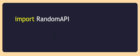
你可以在CodePen上玩这个 API 演示。
CSS打字机效果实现实例:很可能在你的开发过程中的某个时刻,你遇到了 API 提供商登录页面并看到了这样的代码块,演示了他们的 API 的实现。我个人认为这是打字机效果的一个非常实用和相关的实现,并且发现它比静态代码块看起来更有吸引力和吸引人。
产品登陆页面打字效果
这是 SaaS/产品登录页面的示例。
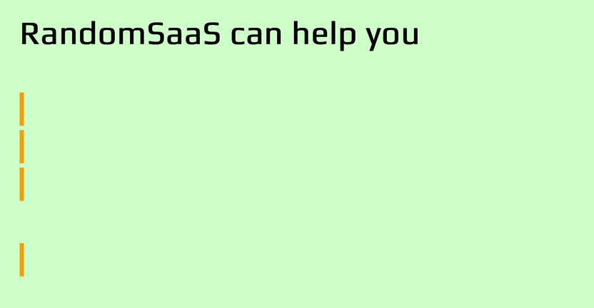
你可以在CodePen上试用这个 SaaS 产品页面演示。
我发现 SaaS 或产品登录页面内的打字机效果对希望使用其产品或服务的访问者更具吸引力和吸引力。花费大量时间开发网络服务和网络应用程序后,我可以从经验中说,打字效果会为你的登录页面带来额外的兴趣。诸如“从今天开始”之类的输入文本为号召性用语文本提供了额外的冲击力。
结论
我们在本文提供的CSS打字机效果创建方法中,我们可以看到使用 CSS 创建动画“打字机”文本是多么容易。这种打字效果绝对可以为你的网页增添趣味和乐趣。
不过,也许值得以温和的警告结束。这种技术最适合用于非关键文本的一小部分,只是为了创造一些额外的乐趣。但是要注意不要过分依赖它,因为像这样使用 CSS 动画有一些限制。确保在各种设备和视口尺寸上测试你的打字机文本,因为结果可能因平台而异。还要考虑依赖辅助技术的最终用户,最好运行一些可用性测试,以确保你不会给用户带来麻烦。因为你可以用纯 CSS 做一些事情并不一定意味着你应该做吧。如果打字机效果对你很重要,并且你想将其用于更重要的内容,那么至少也可以考虑一下 JavaScript 解决方案。
无论如何,我希望你喜欢这篇文章,并且它让你思考可以用 CSS 动画做的其他很酷的事情,为你的网页增添趣味和乐趣。