jQuery提供了非常现代且高度交互的功能高图插件, 供程序员实现用于表示或比较Web和移动应用程序数据的图表。它是多平台的, 并且支持SVG。
你必须在工作文件夹中下载所需的文件, 以便程序员可以将其包含在HTML结构页的开头部分中, 如以下程序中所实现。
下载链接:
https://www.highcharts.com/blog/download/
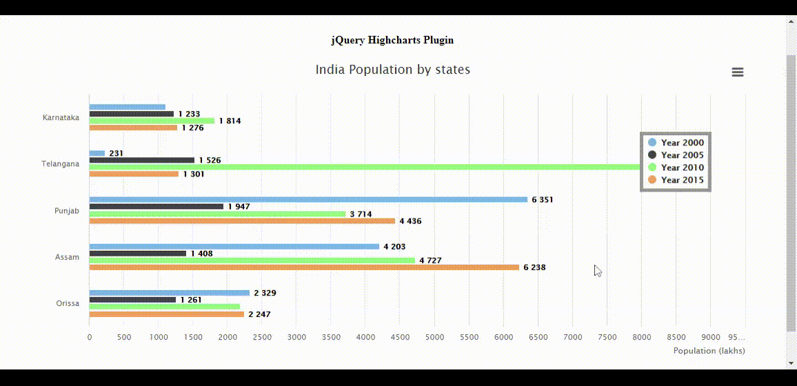
范例1:以下示例通过使用来演示不同状态及其填充的水平条形图高图插入。
<!DOCTYPE HTML>
< html >
     < head >
         < meta http-equiv = "Content-Type"
               content = "text/html; charset=utf-8" >
         < meta name = "viewport"
               content = "width=device-width, initial-scale=1" >
         < title >jQuery Highcharts Plugin</ title >

         < script src = "highcharts.js" ></ script >
         < script src = "exporting.js" ></ script >
         < script src = "export-data.js" ></ script >
         < script src = "accessibility.js" ></ script >

         < style type = "text/css" >

         body{
          text-align:center;
         }

         .highcharts-data-table table, highcharts-figure{
             min-width: 310px;
             max-width: 650px;
             margin: 2em auto;
         }

         #containerDivID{
             height: 450px;
         }

         .highcharts-data-table table {
             font-family: Arial;
             border: 2px solid #e9e9e9;
             margin: 10px auto;
             text-align: center;
             max-width: 500px;
             width: 90%;

         }
         .highcharts-data-table caption {
             padding: 1em 0;
             font-size: 1.1em;
             color: #FFFF;
         }
         .highcharts-data-table tr:hover {
             background: #bedaff;
         }
         .highcharts-data-table th {
             font-weight: 600;
             padding: 0.5em;
         }
         .highcharts-data-table td, .highcharts-data-table th, .highcharts-data-table caption {
             padding: 0.6em;
         }
         .highcharts-data-table thead tr, .highcharts-data-table tr:nth-child(even) {
             background: #f8f8f8;
         }


         </ style >
     </ head >
     < body >
       < h1 style = "color:green" >lsbin</ h1 >
       < b >jQuery Highcharts Plugin</ b >
         < figure class = "highcharts-figure" >
             < div id = "containerDivID" ></ div >
             < p class = "highcharts-description" >
                Column bar charts showing population
                data for various states in India.
             </ p >

         </ figure >

         < script type = "text/javascript" >

             Highcharts.chart('containerDivID', {
                 chart: {
                     type: 'bar'
                 }, title: {
                     text: 'India Population by states'
                 }, xAxis: {
                     categories: ['Karnataka', 'Telangana', 'Punjab', 'Assam', 'Orissa'], }, yAxis: {
                     min: 0, title: {
                         text: 'Population (lakhs)', align: 'high'
                     }, }, tooltip: {
                     valueSuffix: 'lakhs'
                 }, plotOptions: {
                     bar: {
                         dataLabels: {
                             enabled: true
                         }
                     }
                 }, legend: {
                     layout: 'vertical', align: 'right', verticalAlign: 'top', x: -50, y: 100, borderWidth: 5, backgroundColor: Highcharts.defaultOptions
                          .legend.backgroundColor || '#FFFFFF', }, credits: {
                     enabled: false
                 }, series: [{
                     name: 'Year 2000', data: [1107, 231, 6351, 4203, 2329]
                 }, {
                     name: 'Year 2005', data: [1233, 1526, 1947, 1408, 1261]
                 }, {
                     name: 'Year 2010', data: [1814, 8641, 3714, 4727, 2191]
                 }, {
                     name: 'Year 2015', data: [1276, 1301, 4436, 6238, 2247]
                 }]
             });
         </ script >
     </ body >
</ html >
输出如下:
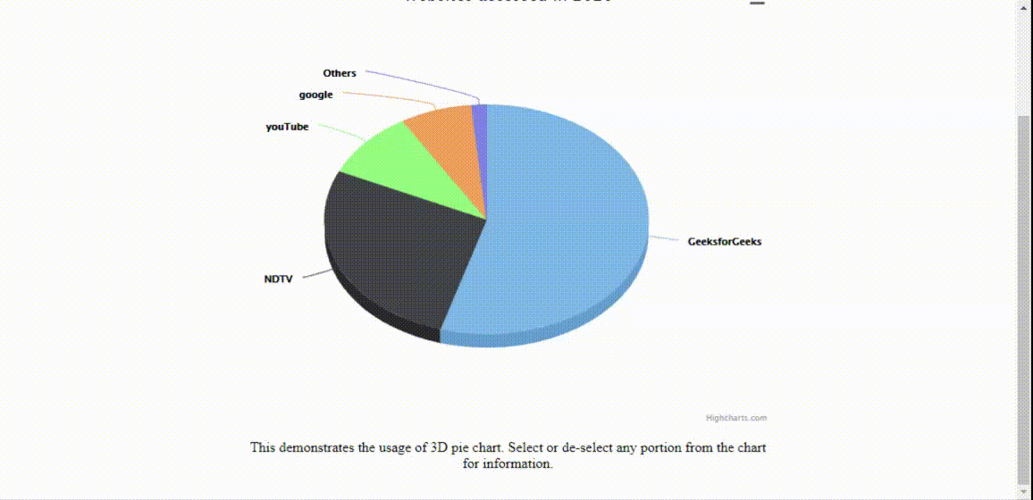
范例2:以下示例演示了3D饼图, 该饼图表示单个用户在特定年份通过使用以下内容访问各种网站高图插入。
<!DOCTYPE HTML>
< html >
     < head >
         < meta http-equiv = "Content-Type"
               content = "text/html; charset=utf-8" >
         < meta name = "viewport"
               content = "width=device-width, initial-scale=1" >
         < title >jQuery Highcharts Plugin</ title >

         < script src = "highcharts.js" ></ script >
                 < script src = "highcharts-3d.js" ></ script >
                 < script src = "exporting.js" ></ script >
                 < script src = "export-data.js" ></ script >
                 < script src = "accessibility.js" ></ script >

         < style type = "text/css" >

             body{
               text-align: center;
             }
             #containerDivID
             {
               height: 500px;
             }

             .highcharts-figure, .highcharts-data-table table
             {
               min-width: 310px;
               max-width: 600px;
               margin: 2em auto;
             }

             .highcharts-data-table table
             {
               font-family: Arial;
               border-collapse: collapse;
               border: 2px solid #e9e9e9;
               margin: 10px auto;
               text-align: center;
               width: 90%;
               max-width: 550px;
             }
             .highcharts-data-table td, .highcharts-data-table th, .highcharts-data-table caption
             {
               padding: 0.6em;
             }
             .highcharts-data-table caption
             {
               padding: 2em 0;
               font-size: 1.3em;
               color: #FFFF;
             }
             .highcharts-data-table th
             {
               font-weight: 600;
               padding: 0.5em;
             }
             .highcharts-data-table tr:hover
             {
               background: #f8f8f8;
             }
             .highcharts-data-table thead tr, .highcharts-data-table tr:nth-child(even)
             {
               background: #ffffff;
             }

            </ style >
     </ head >
     < body >
         < h1 style = "color:green" >
               lsbin
         </ h1 >
         < b >jQuery Highcharts Plugin</ b >

         < figure class = "highcharts-figure" >
             < div id = "containerDivID" ></ div >
             < p class = "highcharts-description" >
                 This demonstrates the usage of 3D pie chart.
                 Select or de-select any portion from the
                 chart for information.
             </ p >
         </ figure >

         < script type = "text/javascript" >

                 Highcharts.chart('containerDivID', {
                     chart: {
                         type: 'pie', options3d: {
                             enabled: true, alpha: 45, beta: 0
                         }
                     }, title: {
                         text: 'Websites accessed in 2020'
                     }, accessibility: {
                         point: {
                             valueSuffix: '%'
                         }
                     }, tooltip: {
                         pointFormat: '{series.name}: {point.percentage:.1f}%'
                     }, plotOptions: {
                         pie: {
                             allowPointSelect: true, cursor: 'pointer', depth: 30, dataLabels: {
                                 enabled: true, format: '{point.name}'
                             }
                         }
                     }, series: [{
                         type: 'pie', name: 'Website used', data: [
                             ['lsbin', 55.0], ['NDTV', 27.5], ['youTube', 9.5], ['google', 7.2], ['Others', 1.5]
                         ]
                     }]
                 });
         </ script >
     </ body >
</ html >
输出如下:
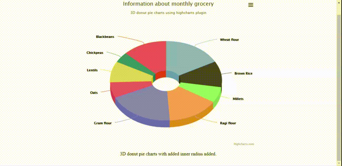
范例3:通过对jQuery代码进行如下简单更改, 可以类似地实现上述示例, 以表示3D甜甜圈饼图。输出图表如下图所示。
<script type= "text/javascript" >

         Highcharts.chart( 'containerDivID' , {
             chart: {
                 type: 'pie' , options3d: {
                     enabled: true , alpha: 45
                 }
             }, title: {
                 text: 'Information about monthly grocery'
             }, subtitle: {
                 text: '3D donut pie charts' +
                       ' using highcharts plugin'
             }, plotOptions: {
                 pie: {
                     innerSize: 100, depth: 45
                 }
             }, series: [{
                 name: 'Delivered amount in kgs' , data: [
                     [ 'Wheat flour' , 8], [ 'Brown Rice' , 5], [ 'Millets' , 3], [ 'Ragi flour' , 7], [ 'Gram flour' , 9], [ 'Oats' , 3], [ 'Lentils' , 4], [ 'Chickpeas' , 2], [ 'Blackbeans' , 6]
                 ]
             }]
         });
  </script>
输出:
通过使用实现的所有图表高图插件可以扩展到高表插入。通过使用Highcharts库, 存在一种将HTML表格数据转换为所需图表的方法。
下载链接, 除了在标题中还包含所需文件高图插件的文件。
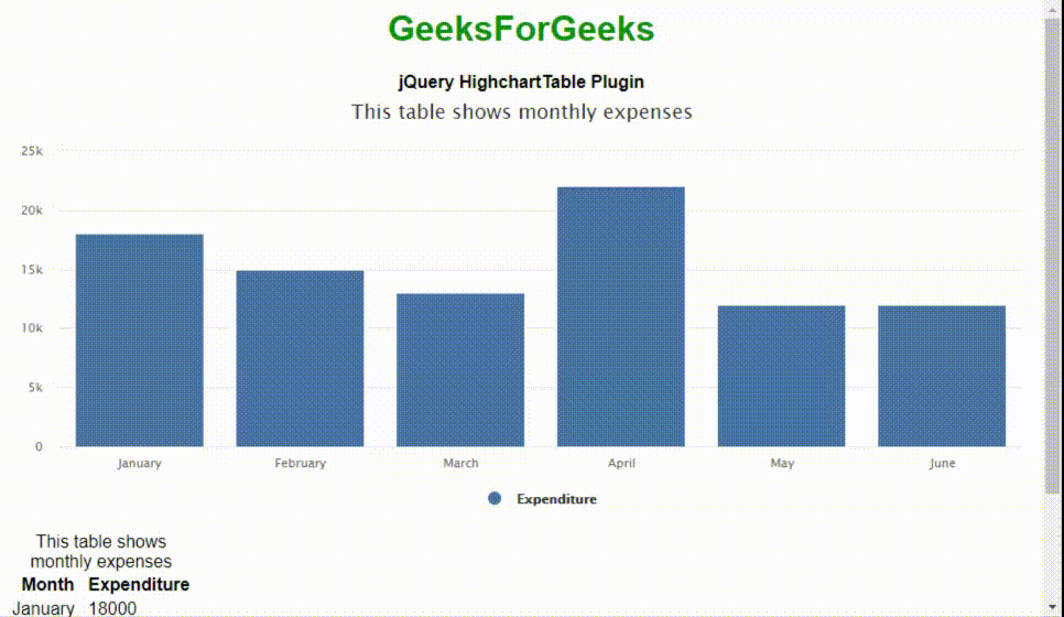
范例4:以下示例演示了非常基本的高表插件使用情况显示带有每月费用的柱形图。
<!DOCTYPE html>
< html >
     < head >
         < title >jQuery HighchartTable Plugin</ title >
         < meta charset = "UTF-8" >

         < script  src =
"https://cdnjs.cloudflare.com/ajax/libs/jquery/1.11.3/jquery.min.js" >
         </ script >
         < script src = "highcharts.js" ></ script >
         < script src = "jquery.highchartTable.js" ></ script >
         < style >
             body
             {
                font-family: Arial;
                text-align:center;
             }
             #containerDivID{
               width:550px;
               height:auto;
             }
         </ style >
     </ head >
     < body >
         < h1 style = "color:green" >lsbin</ h1 >
         < b >jQuery HighchartTable Plugin</ b >
         < div class = "containerDivID" >
             < table class = "highchart"
                    data-graph-container-before = "1"
                    data-graph-type = "column" >
                 < thead >
                     < tr >
                         < th >Month</ th >
                         < th >Expenditure</ th >
                     </ tr >
                 </ thead >
                 < tbody >
                     < tr >
                         < td >January</ td >
                         < td >18000</ td >
                     </ tr >
                     < tr >
                         < td >February</ td >
                         < td >15000</ td >
                     </ tr >
                     < tr >
                         < td >March</ td >
                         < td >13000</ td >
                     </ tr >
                     < tr >
                         < td >April</ td >
                         < td >22000</ td >
                     </ tr >
                     < tr >
                        < td >May</ td >
                        < td >12000</ td >
                     </ tr >
                     < tr >
                        < td >June</ td >
                        < td >12000</ td >
                     </ tr >
                 </ tbody >
             </ table >
         </ div >

         < script >
            $(document).ready(function() {
               $('table.highchart').highchartTable();
            });

         </ script >
     </ body >
</ html >
输出如下:
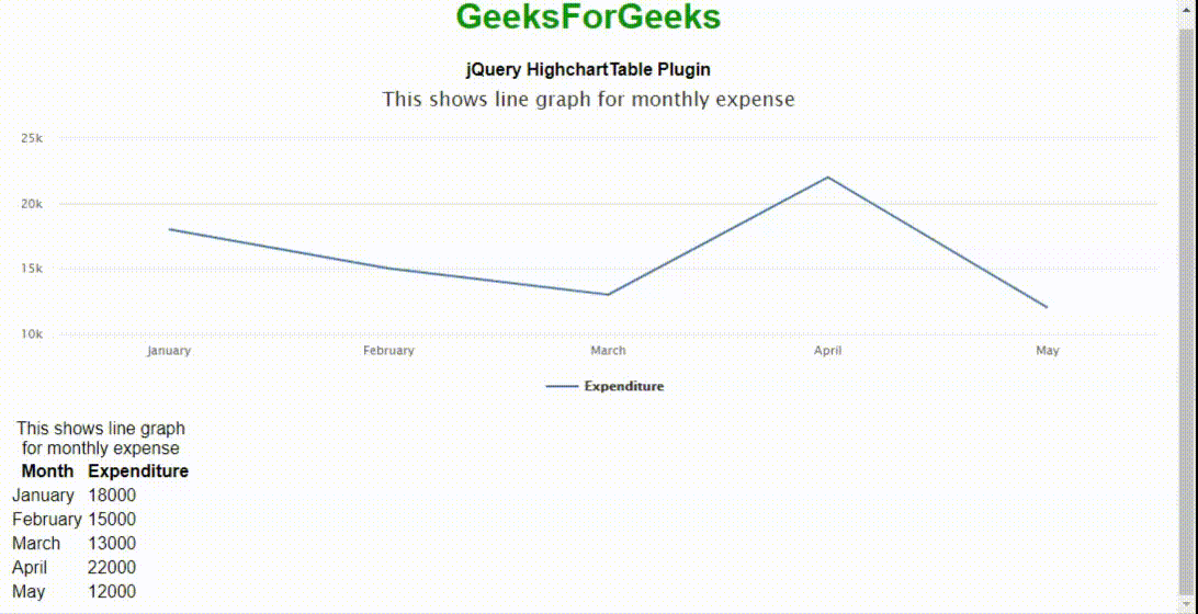
范例5:以下示例演示了折线图的使用高表插入。
<!DOCTYPE html>
< html >
     < head >
         < title >jQuery HighchartTable Plugin</ title >
         < meta charset = "UTF-8" />

         < script src =
"https://cdnjs.cloudflare.com/ajax/libs/jquery/1.11.3/jquery.min.js" >
         </ script >
         < script src = "highcharts.js" ></ script >
         < script src = "jquery.highchartTable.js" ></ script >
         < style >
             body {
                 font-family: Arial;
                 text-align: center;
             }
             #containerDivID {
                 width: 550px;
                 height: auto;
             }
         </ style >
     </ head >
     < body >
         < h1 style = "color: green;" >
           lsbin
         </ h1 >
         < b >jQuery HighchartTable Plugin</ b >
         < div class = "containerDivID" >
             < table class = "highchart"
                    data-graph-container-before = "1"
                    data-graph-type = "line"
                    data-graph-height = "310px"
                    data-graph-width = "500px" >
                 < caption >
                     This shows line graph for
                     monthly expense
                 </ caption >
                 < thead >
                     < tr >
                         < th >Month</ th >
                         < th >Expenditure</ th >
                     </ tr >
                 </ thead >
                 < tbody >
                     < tr >
                         < td >January</ td >
                         < td >18000</ td >
                     </ tr >
                     < tr >
                         < td >February</ td >
                         < td >15000</ td >
                     </ tr >
                     < tr >
                         < td >March</ td >
                         < td >13000</ td >
                     </ tr >
                     < tr >
                         < td >April</ td >
                         < td >22000</ td >
                     </ tr >
                     < tr >
                         < td >May</ td >
                         < td >12000</ td >
                     </ tr >
                 </ tbody >
             </ table >
         </ div >
         < script >
             $(document).ready(function () {
                 $("table.highchart").highchartTable();
             });
         </ script >
     </ body >
</ html >
输出:
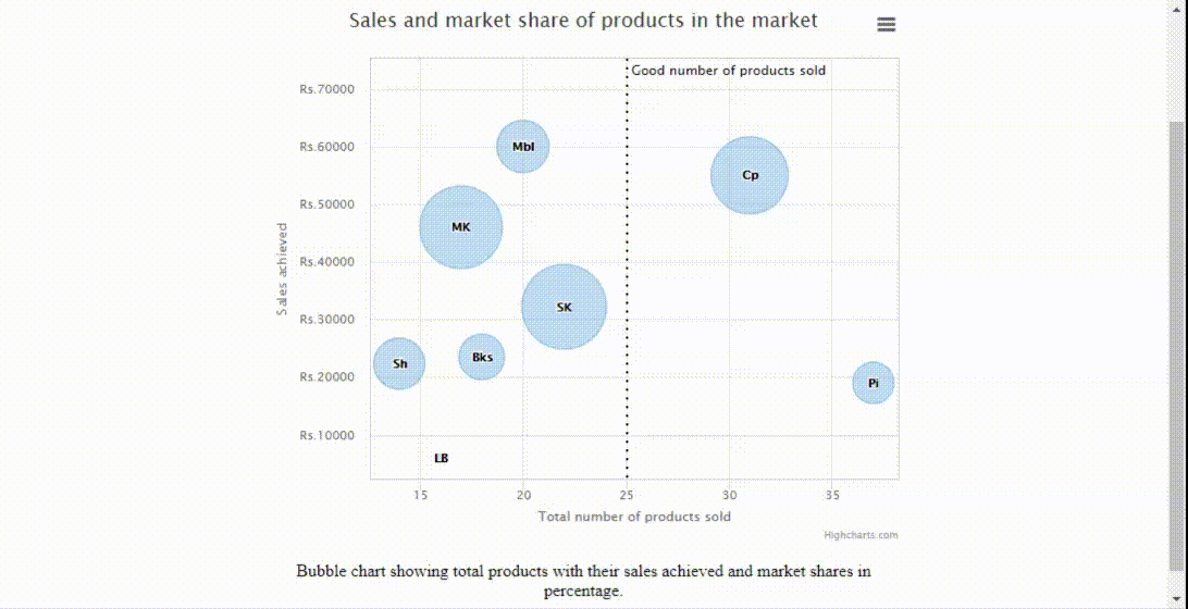
范例6:以下示例演示了使用高图外挂程式, 代表约3个维度的资料。气泡图通常使用x值, y值和z(大小)值绘制图形。水平x和垂直y是值轴, z表示其大小。
<!DOCTYPE html>
< html >
< head >
     < meta http-equiv = "Content-Type"
           content = "text/html; charset=utf-8" />
     < meta name = "viewport"
           content = "width=device-width, initial-scale=1" />
     < title >jQuery Highcharts Plugin</ title >

     < script src = "highcharts.js" ></ script >
     < script src = "highcharts-more.js" ></ script >
     < script src = "exporting.js" ></ script >
     < script src = "export-data.js" ></ script >
     < script src = "accessibility.js" ></ script >

     < style type = "text/css" >
         body {
             text-align: center;
         }
         .highcharts-figure, .highcharts-data-table table {
             min-width: 310px;
             max-width: 600px;
             margin: 2em auto;
         }

         #containerDivID {
             height: 500px;
         }

         .highcharts-data-table table {
             font-family: Arial;
             border-collapse: collapse;
             border: 2px solid #e9e9e9;
             margin: 10px auto;
             text-align: center;
             width: 90%;
             max-width: 550px;
         }
         .highcharts-data-table caption {
             padding: 2em 0;
             font-size: 1.3em;
             color: #ffff;
         }
         .highcharts-data-table th {
             font-weight: 600;
             padding: 0.5em;
         }
         .highcharts-data-table td, .highcharts-data-table th, .highcharts-data-table caption {
             padding: 0.5em;
         }
         .highcharts-data-table thead tr, .highcharts-data-table tr:nth-child(even) {
             background: #f8f8f8;
         }
         .highcharts-data-table tr:hover {
             background: #ffffff;
         }
     </ style >
</ head >
< body >
     < h1 style = "color: green;" >lsbin</ h1 >
     < b >jQuery Highcharts Plugin</ b >

     < figure class = "highcharts-figure" >
         < div id = "containerDivID" ></ div >
         < p class = "highcharts-description" >
             Bubble chart showing total products with their
             sales achieved and market shares in percentage.
         </ p >
     </ figure >

     < script type = "text/javascript" >
         Highcharts.chart("containerDivID", {
             chart: {
                 type: "bubble", plotBorderWidth: 1, zoomType: "xy", }, legend: {
                 enabled: false, }, title: {
                 text: "Sales and market share of"+
                       " products in the market", }, accessibility: {
              point: {
                  valueDescriptionFormat: "{index}. {point.name}, "+
                                          "Product count: {point.x}, "+
                                          "Sales: Rs.{point.y}, "+
                                          "Market share: {point.z}%.", }, }, xAxis: {
                 gridLineWidth: 1, title: {
                     text: "Total number of products sold", }, labels: {
                     format: "{value} ", }, plotLines: [
                     {
                         color: "black", dashStyle: "dot", width: 2, value: 25, label: {
                             rotation: 0, y: 15, style: {
                                 fontStyle: "arial", }, text: "Good number of products sold", }, zIndex: 3, }, ], accessibility: {
                     rangeDescription: "Range: 20 to 30 numbers.", }, }, yAxis: {
                 startOnTick: false, endOnTick: false, title: {
                     text: "Sales achieved", }, labels: {
                     format: "Rs.{value} ", }, maxPadding: 0.2, plotLines: [
                     {
                         color: "black", dashStyle: "dot", width: 2, value: 50, label: {
                             align: "right", style: {
                                 fontStyle: "arial", }, text: "Good number for products sold", x: -10, }, zIndex: 3, }, ], accessibility: {
                     rangeDescription: "Range: 0 to 60, 000 rupees.", }, }, tooltip: {
                 useHTML: true, headerFormat: "< table >", pointFormat:
                     '< tr >< th colspan = "2" >{point.product}</ th ></ tr >' +
                     "< tr >< th >Products sold:</ th >< td >{point.x}</ td ></ tr >" +
                     "< tr >< th >Sales achieved :</ th >< td >Rs.{point.y}</ td ></ tr >" +
                     "< tr >< th >Market share:</ th >< td >{point.z}%</ td ></ tr >", footerFormat: "</ table >", followPointer: true, }, plotOptions: {
                 series: {
                     dataLabels: {
                         enabled: true, format: "{point.name}", }, }, }, series: [
             {
                 data: [
                     { x: 16, y: 5900, z: 3, name: "LB", product: "Ladies Bag" }, { x: 14, y: 22340, z: 14.7, name: "Sh", product: "Shoes" }, { x: 20, y: 60000, z: 15.8, name: "Mbl", product: "Mobile" }, { x: 18, y: 23500, z: 12, name: "Bks", product: "Books" }, { x: 22, y: 32200, z: 42, name: "SK", product: "Saving kit" }, { x: 31, y: 55000, z: 35, name: "Cp", product: "Cooking pans" }, { x: 17, y: 46000, z: 40, name: "MK", product: "Makeup kit" }, { x: 37, y: 19000, z: 10, name: "Pi", product: "Piano" }, ], }, ], });
     </ script >
</ body >
</ html >
输出如下:
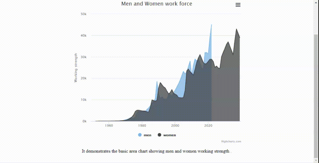
范例7:以下示例演示了使用高图插入。这些类似于之前展示的折线图, 不同之处在于可视化数据量。
<!DOCTYPE html>
< html >
< head >
     < meta http-equiv = "Content-Type"
           content = "text/html; charset=utf-8" />
     < meta name = "viewport"
           content = "width=device-width, initial-scale=1" />
     < title >Highcharts Example</ title >

     < script src = "highcharts.js" ></ script >
     < script src = "exporting.js" ></ script >
     < script src = "export-data.js" ></ script >
     < script src = "accessibility.js" ></ script >

     < style type = "text/css" >
         body {
             text-align: center;
         }
         .highcharts-figure, .highcharts-data-table table {
             min-width: 310px;
             max-width: 600px;
             margin: 2em auto;
         }

         #containerDivID {
             height: 500px;
         }

         .highcharts-data-table table {
             font-family: Arial;
             border-collapse: collapse;
             border: 2px solid #e9e9e9;
             margin: 10px auto;
             text-align: center;
             width: 90%;
             max-width: 550px;
         }
         .highcharts-data-table caption {
             padding: 2em 0;
             font-size: 1.3em;
             color: #ffff;
         }
         .highcharts-data-table th {
             font-weight: 600;
             padding: 0.5em;
         }
         .highcharts-data-table td, .highcharts-data-table th, .highcharts-data-table caption {
             padding: 0.5em;
         }
         .highcharts-data-table thead tr, .highcharts-data-table tr:nth-child(even) {
             background: #f8f8f8;
         }
         .highcharts-data-table tr:hover {
             background: #ffffff;
         }
     </ style >
</ head >
< body >
     < h1 style = "color: green;" >lsbin</ h1 >
     < b >jQuery Highcharts Plugin</ b >

     < figure class = "highcharts-figure" >
         < div id = "containerDivID" ></ div >
         < p class = "highcharts-description" >
             It demonstrates the basic area chart
             showing men and women working strength .
         </ p >
     </ figure >

     < script type = "text/javascript" >
         Highcharts.chart("containerDivID", {
             chart: {
                 type: "area", }, accessibility: {
                 description: "Image description: An area chart compares"+
                              " the working strength of the men and women"+
                              " between 1950 and 2020. The number men or "+
                              " women are plotted on the Y-axis and the "+
                              " years on the X-axis. ", }, title: {
                 text: "Men and Women work force", }, xAxis: {
                 allowDecimals: false, labels: {
                     formatter: function () {
                         return this.value;
                     }, }, accessibility: {
                  rangeDescription: "Years between : 1950 to 2020.", }, }, yAxis: {
                 title: {
                     text: "Working strength", }, labels: {
                     formatter: function () {
                         return this.value / 1000 + "k";
                     }, }, }, tooltip: {
              pointFormat: "{series.name} reached {point.y:, .0f}"+
                           " in numbers in year {point.x}", }, plotOptions: {
                 area: {
                     pointStart: 1950, marker: {
                         enabled: false, symbol: "circle", radius: 2, states: {
                             hover: {
                                 enabled: true, }, }, }, }, }, series: [
                 {
                     name: "men", data: [
                         null, null, 17, 12, 17, 13, 21, 14, 16, 19, 32, 21, 35, 25, 25, 55, 125, 155, 215, 427, 655, 852, 1160, 1617, 1478, 1321, 2138, 4221, 4512, 4502, 4502, 4500, 4501, 5502, 6229, 7189, 8139, 9199, 10538, 18517, 12527, 10475, 11421, 10358, 10295, 10104, 12610, 12401, 11643, 13092, 14478, 15915, 17385, 19055, 21215, 23210, 22010, 23044, 25393, 27935, 21000, 26000, 29000, 28010, 29020, 27010, 25000, 24000, 31982, 32040, 31233, 39197, 45000, ], }, {
                     name: "women", data: [
                         null, null, 11, 12, 22, 23, 24, 27, 28, 32, 27, 45, 67, 78, 86, 92, 112, 201, 250, 289, 369, 621, 1005, 1436, 2063, 3057, 4618, 5113, 5113, 4954, 4804, 4761, 4717, 4368, 4218, 6444, 9914, 9620, 9326, 9822, 15468, 18020, 17020, 16020, 15507, 14062, 12787, 13287, 14747, 13076, 12551, 12144, 11009, 10950, 10871, 11004, 14304, 23464, 24314, 23086, 22380, 21434, 24126, 27387, 29459, 31056, 29224, 27342, 26662, 26926, 27912, 28909, 28905, 27826, 25079, 25702, 24826, 24605, 30062, 32049, 33852, 35804, 37000, 35020, 33011, 31008, 37431, 43000, 41000, 39000, ], }, ], });
     </ script >
</ body >
</ html >
输出如下:
插件中还有许多其他漂亮的图表类型。程序员可以根据应用程序的要求进行探索和实现。