什么是CSS动画?
CSS动画是一种更改网页中各种元素的外观和行为的技术。它用于通过更改元素的运动或显示来控制元素。它包括两部分, 一部分包含描述元素动画的CSS属性, 另一部分包含某些关键帧, 这些关键帧指示元素的动画属性以及必须发生的特定时间间隔。
@keyframes规则:关键帧是CSS动画工作的基础。它们定义了动画整个持续时间的各个阶段的显示。例如:在下面的代码中, 该段落随时间更改其颜色。完成度为0%时为红色, 完成度为50%时为橙色, 完全完成度为100%时为棕色。
例子:
<!DOCTYPE html>
< html >
     < head >
         < style >
             #gfg {
                 animation-name: color;
                 animation-duration: 25s;
                 padding-top:30px;
                 padding-bottom:30px;
                 font-family:Times New Roman;
             }
             #geeks {
                 font-size: 40px;
                 text-align:center;
                 font-weight:bold;
                 color:#090;
                 padding-bottom:5px;
             }
             #geeks1 {
                 font-size:17px;
                 font-weight:bold;
                 text-align:center;
             }
             @keyframes color {
                 0% {
                     background-color: red;
                 }
                 50% {
                     background-color: orange;
                 }
                 100% {
                     background-color: brown;
                 }
             }
         </ style >
     </ head >
     < body >
         < div id = "gfg" >
             < div id = "geeks" >lsbin</ div >
             < div id = "geeks1" >A computer science portal for geeks</ div >
         </ div >
     </ body >
</ html >
输出如下:
极客
极客的计算机科学门户
动画属性:下面提供了某些动画属性:
animation-name:用于指定描述动画的@keyframes的名称。 animation-name:动画名称;
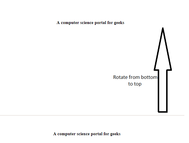
动画时间:
它用于指定动画完成一个周期所需的时间。
例子:
< html >
     < head >
         < style >
             #gfg1 {
                 animation-name: text;
                 animation-duration: 5s;
                 animation-iteration-count: infinite;

             }
             #geek1 {
                 font-size: 40px;
                 text-align:center;
                 font-weight:bold;
                 color:#090;
                 padding-bottom:5px;
             }
             #geek2 {
                 font-size:17px;
                 font-weight:bold;
                 text-align:center;
             }
             @keyframes text {

                 from {

                     margin-top: 400px;
                 }
                 to {
                     margin-top: 0px;
                 }
             }
         </ style >
     </ head >
     < body >
         < div id = "gfg1" >
             < div id = "geek1" >lsbin</ div >
             < div id = "geek2" >A computer science portal for geeks</ div >
         </ div >
     </ body >
</ html >
输出如下:
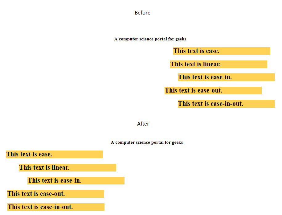
动画定时功能:
指定动画如何通过关键帧进行过渡。它可以具有以下值:
- 缓解:动画开始缓慢, 然后快速, 然后最终缓慢结束(这是默认设置)
- 线性:动画从头到尾以相同的速度播放
- 缓入:动画播放缓慢
- 缓和:动画播放缓慢
- 缓入:动画开始和结束缓慢。
例子:
<!DOCTYPE html>
< html >
     < head >
         < style >
             .geeks {
                 font-size: 40px;
                 text-align:center;
                 font-weight:bold;
                 color:#090;
                 padding-bottom: 5px;
                 font-family:Times New Roman;
             }
             .geeks1 {
                 font-size:17px;
                 font-weight:bold;
                 text-align:center;
                 font-family:Times New Roman;
             }
             h2 {
                 width: 350px;
                 animation-name: text;
                 animation-duration: 4s;
                 animation-iteration-count: infinite;
                 background-color: rgb(255, 210, 85);
             }
             #one {
                 animation-timing-function: ease;
             }
             #two {
                 animation-timing-function: linear;
             }
             #three {
                 animation-timing-function: ease-in;
             }
             #four {
                 animation-timing-function: ease-out;
             }
             #five {
                 animation-timing-function: ease-in-out;
             }
             @keyframes text {
                 from {
                     margin-left: 60%;
                 }
                 to {
                     margin-left: 0%;
                 }
             }
         </ style >
     </ head >
     < body >
         < div class = "geeks" >lsbin</ div >
         < div class = "geeks1" >A computer science portal for geeks</ div >
         < h2 id = "one" >This text is ease.</ h2 >
         < h2 id = "two" >This text is linear.</ h2 >
         < h2 id = "three" >This text is ease-in.</ h2 >
         < h2 id = "four" >This text is ease-out.</ h2 >
         < h2 id = "five" >This text is ease-in-out.</ h2 >
     </ body >
</ html >
输出如下:
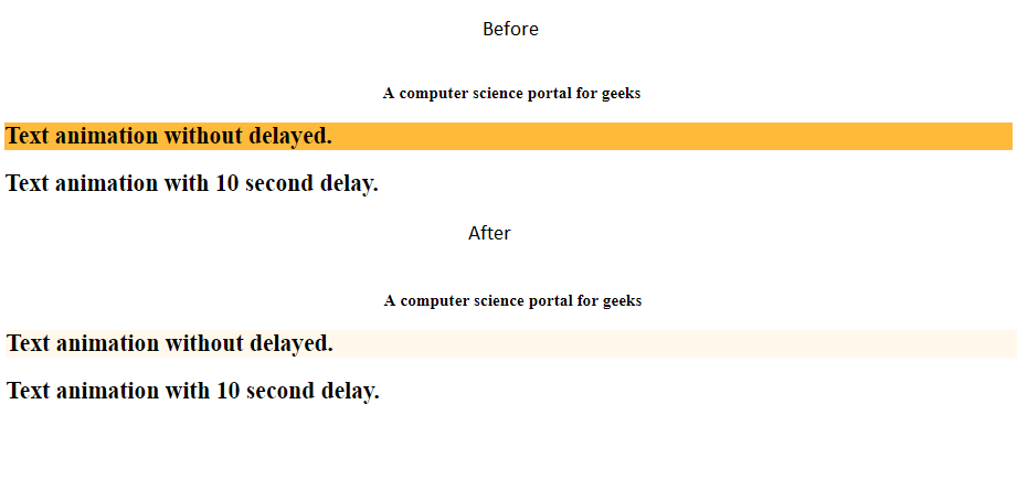
动画延迟:
用于指定动画开始时的延迟。
例子:
<!DOCTYPE html>
< html >
     < head >
         < style >
             .geeks {
                 font-size: 40px;
                 text-align:center;
                 font-weight:bold;
                 color:#090;
                 padding-bottom:5px;
                 font-family:Times New Roman;
             }
             .geeks1 {
                 font-size:17px;
                 font-weight:bold;
                 text-align:center;
                 font-family:Times New Roman;
             }
             #one {
                 animation-name: example;
                 animation-duration: 10s;

             }
             #two {
                 animation-name: example;
                 animation-duration: 10s;
                 animation-delay: 10s;
             }
             @keyframes example {
                 from {
                     background-color: orange;
                 }
                 to {
                     background-color: white;
                 }
             }
         </ style >
     </ head >
     < body >
         < div class = "geeks" >lsbin</ div >
         < div class = "geeks1" >A computer science portal for geeks</ div >
         < h2 id = "one" >Text animation without delayed.</ h2 >
         < h2 id = "two" >Text animation with 10 second delay.</ h2 >
     </ body >
</ html >
输出如下:
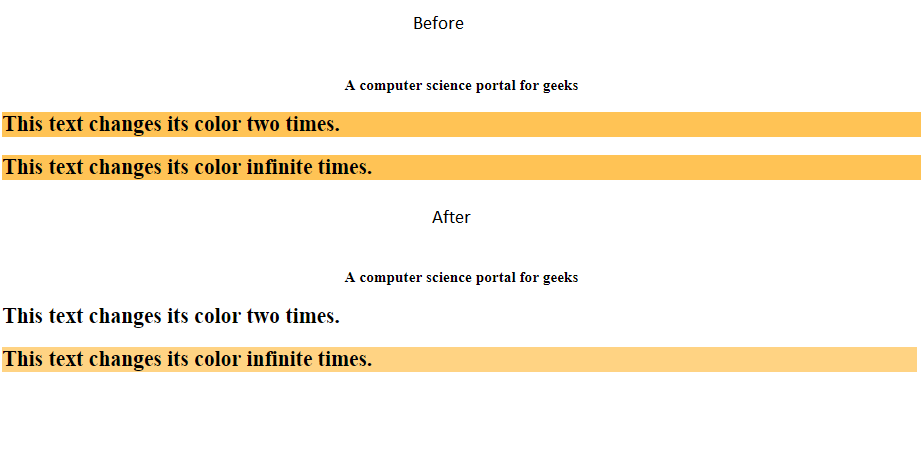
动画迭代次数:
它用于指定动画重复的次数。它可以指定为infinite, 以无限期重复动画。
例子:
<!DOCTYPE html>
< html >
     < head >
         < style >
             .geeks {
                 font-size: 40px;
                 text-align:center;
                 font-weight:bold;
                 color:#090;
                 padding-bottom:5px;
                 font-family:Times New Roman;
             }
             .geeks1 {
                 font-size:17px;
                 font-weight:bold;
                 text-align:center;
                 font-family:Times New Roman;
             }
             #one {
                 animation-name: example;
                 animation-duration: 2s;
                 animation-iteration-count: 2;
             }
             #two {
                 animation-name: example;
                 animation-duration: 2s;
                 animation-iteration-count: infinite;
             }
             @keyframes example {
                 from {
                     background-color: orange;
                 }
                 to {
                     background-color: white;
                 }
             }
         </ style >
     </ head >
     < body >
         < div class = "geeks" >lsbin</ div >
         < div class = "geeks1" >A computer science portal for geeks</ div >
         < h2 id = "one" >This text changes its color two times.</ h2 >
         < h2 id = "two" >This text changes its color infinite times.</ h2 >
     </ body >
</ html >
输出如下:
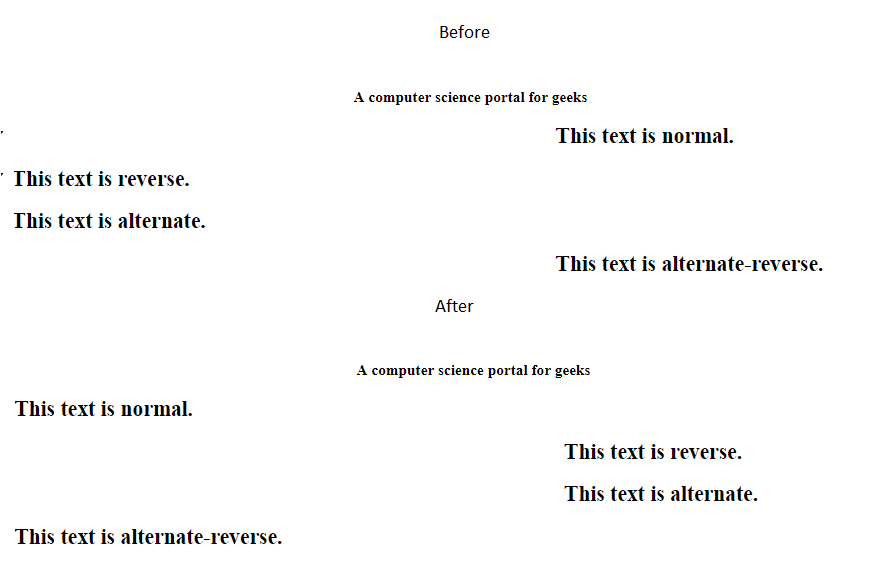
动画方向:
指定动画的方向。它可以具有以下值:
- 正常:动画将向前播放。这是默认值。
- 逆转:动画以反方向播放, 即向后播放
- 备用:动画先播放, 然后播放
- 交替反向:动画先向后播放, 然后向前播放。
例子:
<!DOCTYPE html>
< html >
     < head >
         < style >
             .geeks {
                 font-size: 40px;
                 text-align:center;
                 font-weight:bold;
                 color:#090;
                 padding-bottom:5px;
                 font-family:Times New Roman;
             }
             .geeks1 {
                 font-size:17px;
                 font-weight:bold;
                 text-align:center;
                 font-family:Times New Roman;
             }
             h2 {
                 width: 100%;
                 animation-name: text;
                 animation-duration: 2s;
                 animation-iteration-count: infinite;
             }
             #one {
                 animation-direction: normal;
             }
             #two {
                 animation-direction: reverse;
             }
             #three {
                 animation-direction: alternate;
             }
             #four {
                 animation-direction: alternate-reverse;
             }
             @keyframes text {
                 from {
                     margin-left: 60%;
                 }
                 to {
                     margin-left: 0%;
                 }
             }
         </ style >
     </ head >
     < body >
         < div class = "geeks" >lsbin</ div >
         < div class = "geeks1" >A computer science portal for geeks</ div >
         < h2 id = "one" >This text is normal.</ h2 >
         < h2 id = "two" >This text is reverse.</ h2 >
         < h2 id = "three" >This text is alternate.</ h2 >
         < h2 id = "four" >This text is alternate-reverse.</ h2 >
     </ body >
</ html >
输出如下:
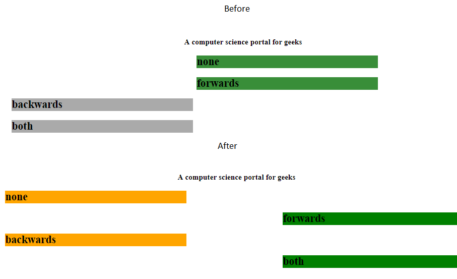
动画填充模式:
指定动画在执行之前和之后应用哪些值。
- 没有:动画在执行之前或之后不会对元素应用任何属性。 (默认)
- 转发:动画完成后, 该元素将保留与最后一个关键帧相同的动画属性。
- 向后:元素将在动画开始之前获取第一个关键帧的属性。
- 都:动画将遵循向前和向后的规则, 即它将获得在开始之前为初始关键帧定义的属性, 并在动画完成后保留最后一个关键帧的值。
例子:
<!DOCTYPE html>
< html >
     < head >
         < style >
             .geeks {
                 font-size: 40px;
                 text-align:center;
                 font-weight:bold;
                 color:#090;
                 padding-bottom:5px;
                 font-family:Times New Roman;
             }
             .geeks1 {
                 font-size:17px;
                 font-weight:bold;
                 text-align:center;
                 font-family:Times New Roman;
             }
             h2 {
                 width: 400px;
                 background-color: orange;
                 animation-name: text;
                 animation-duration: 3s;
             }
             #one {
                 animation-fill-mode: none;
             }
             #two {
                 animation-fill-mode: forwards;
             }
             #three {
                 animation-fill-mode: backwards;
                 animation-delay: 2s;
             }
             #four {
                 animation-fill-mode: both;
                 animation-delay: 2s;
             }
             @keyframes text {
                 from {
                     margin-left: 0%;
                     background-color: #aaaaaa;
                 }
                 to {
                     margin-left: 60%;
                     background-color: #008000;
                 }
             }
         </ style >
     </ head >
     < body >
         < div class = "geeks" >lsbin</ div >
         < div class = "geeks1" >A computer science portal for geeks</ div >
         < h2 id = "one" >none</ h2 >
         < h2 id = "two" >forwards</ h2 >
         < h2 id = "three" >backwards</ h2 >
         < h2 id = "four" >both</ h2 >
     </ body >
</ html >
输出如下:
animation-play-state:允许你播放/暂停动画。
动画速记属性:这是隐含动画属性以获得更快速代码的一种简便方法。这些属性应按以下顺序:
animation: [animation-name] [animation-duration] [animation-timing-function] [animation-delay]
          [animation-iteration-count] [animation-direction] [animation-fill-mode] [animation-play-state];
例如, 通常动画代码将如下所示:
例子:
<!DOCTYPE html>
< html >
     < head >
         < style >
             #g4g {
                 width: 400px;
                 height: 100px;
                 position: relative;
                 animation-name: GFG;
                 animation-duration: 5s;
                 animation-timing-function: linear;
                 animation-delay: 1s;
                 animation-iteration-count: infinite;
                 animation-direction: alternate;
             }
             @keyframes GFG {
                 0% {left:0px; top:0px;}
                 25% {left:200px; top:200px;}
                 50% {left:200px; top:0px;}
                 75% {left:0px; top:200px;}
                 100% {left:0px; top:0px;}
             }
         </ style >
     </ head >
     < body >
         < img id = "g4g" src =
"https://media.lsbin.org/wp-content/cdn-uploads/lsbinLogoHeader.png" >
     </ body >
</ html >
输出如下:

简而言之, 上面的HTML代码可以写成:
例子:
<!DOCTYPE html>
< html >
     < head >
         < style >
             #geeks4g {
                 width: 400px;
                 height: 100px;
                 position: relative;
                 animation: GFG 5s linear 1s infinite alternate;
             }
             @keyframes GFG{
                 0% {left:0px; top:0px;}
                 25% {left:200px; top:200px;}
                 50% {left:200px; top:0px;}
                 75% {left:0px; top:200px;}
                 100% {left:0px; top:0px;}
             }
         </ style >
     </ head >
     < body >
         < img id = "geeks4g" src =
"https://media.lsbin.org/wp-content/cdn-uploads/lsbinLogoHeader.png" >
     </ body >
</ html >
输出如下: